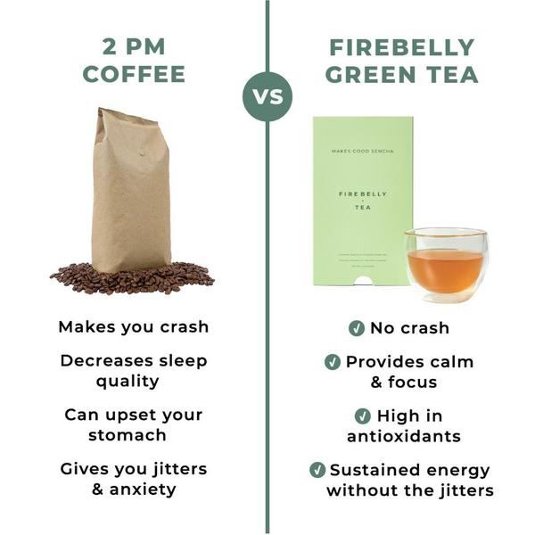
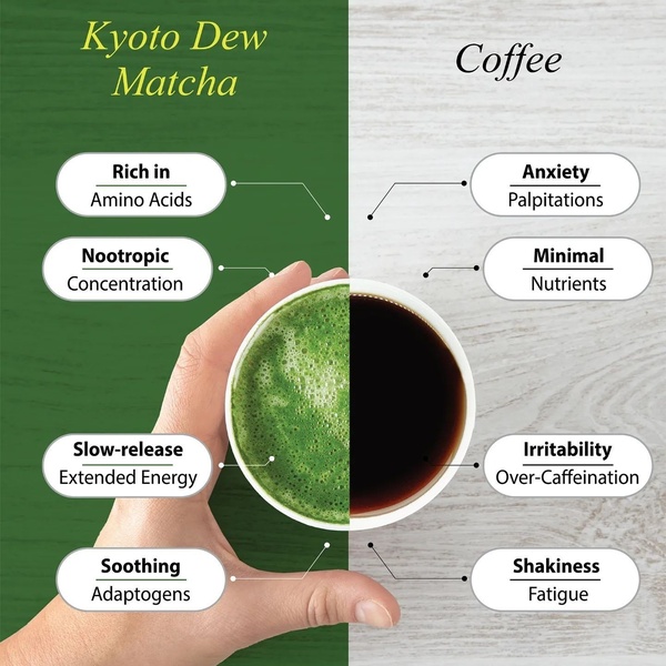
A side-by-side comparison chart contrasting the negative side effects of 2 PM coffee against the clean, sustained benefits of green tea.
Free credits included. No card required
This green tea creative uses a stark side-by-side comparison, positioning the product against a common 'villain'—the afternoon coffee crash. The visual layout immediately communicates a clear value proposition by mapping negative pain points to the positive outcomes of the featured drink. This contrast technique is highly effective for educating customers who are already experiencing the problem but may not have considered the product as an alternative solution.
For most ecommerce brands, simplifying complex health benefits into a binary 'Us vs Them' choice removes friction for the buyer. By using Promer AI to refine these claims, you can ensure your messaging remains grounded in product reality rather than empty hype. This approach is typically successful when the target audience is already looking to switch from an habit that no longer serves them.
Great ads start from an idea, a feeling, or a structure, not a blank design.
Pro tip
When building a comparison chart, keep the number of points equal for both sides to maintain visual balance. A symmetrical grid helps the reader subconsciously process the 'better' choice faster, making the conclusion feel inevitable.
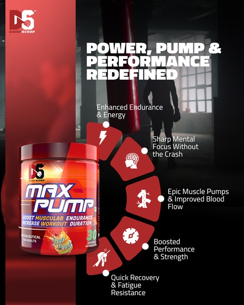




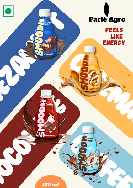






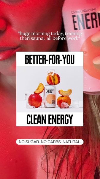



Promer helps you find the pattern, adapt it to your product, and create your own version in minutes.






