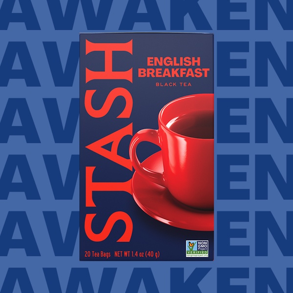
A high-contrast 1:1 image featuring a bold red mug against a dark blue background with repetitive branding text.
Free credits included. No card required
The use of high-contrast color theory makes this black tea advertisement pop on crowded social feeds. By placing a vibrant red mug against a deep navy blue background, the brand ensures the product remains the absolute focal point while the repeated background text reinforces the brand identity.
This structural approach to visual hierarchy is a proven method for grabbing attention in seconds. Performance marketers using Promer AI can leverage similar high-contrast layout principles to ensure their product imagery stands out, regardless of the industry, provided the contrast ratios are optimized for the intended platform audience.
Great ads start from an idea, a feeling, or a structure, not a blank design.
Pro tip
When using high-contrast color schemes, ensure your call-to-action color remains distinct from both the primary product color and the background. Testing a neutral secondary color often creates a better 'click-through' balance than just matching the brand's primary color.


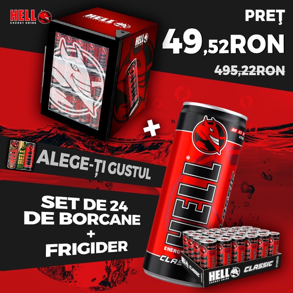


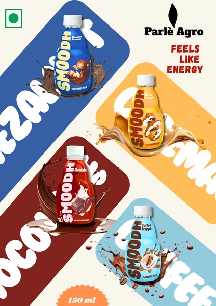







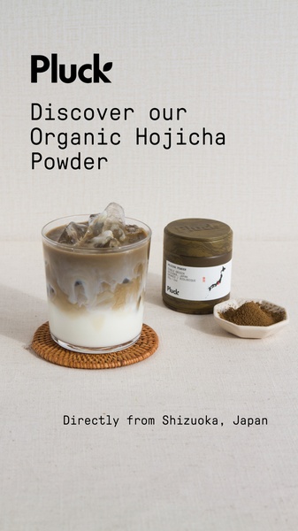
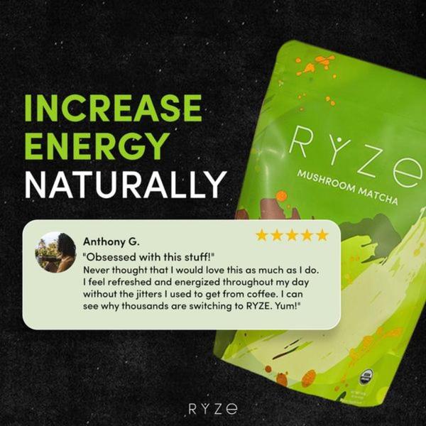
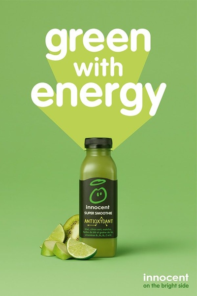


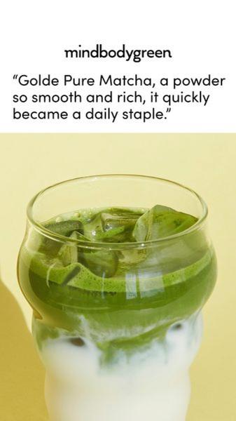
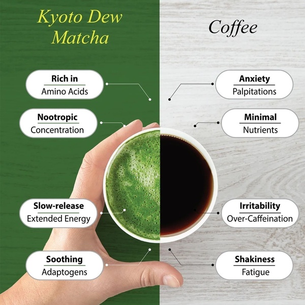
Promer helps you find the pattern, adapt it to your product, and create your own version in minutes.






