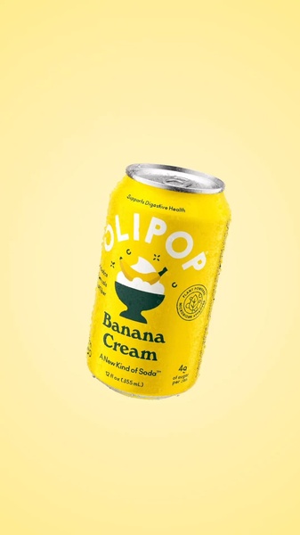
A high-clarity, isolated image of a soda can featuring a clean background and balanced composition to highlight the product features.
Free credits included. No card required
This soda can creative leverages a high-contrast, isolated visual strategy to eliminate clutter and keep the user's focus strictly on the product. By utilizing a clean, singular focus, the design creates an instant visual stop in the feed that communicates freshness and simplicity immediately upon viewing. The bright color palette and centered orientation ensure that the product is the absolute hero of the frame. Because this design relies on color theory and negative space, it is a highly effective way for Promer AI users to establish brand recognition quickly. In most cases, simple compositions like this perform exceptionally well because they reduce the cognitive load for the viewer, allowing your brand's unique packaging to stand out against busy social media backdrops.
Great ads start from an idea, a feeling, or a structure, not a blank design.
Pro tip
When using minimalist layouts, ensure your packaging text is perfectly legible at mobile sizes. If your product is smaller, consider using a subtle drop shadow to ground the object and provide depth against the flat background.
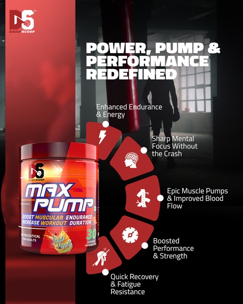

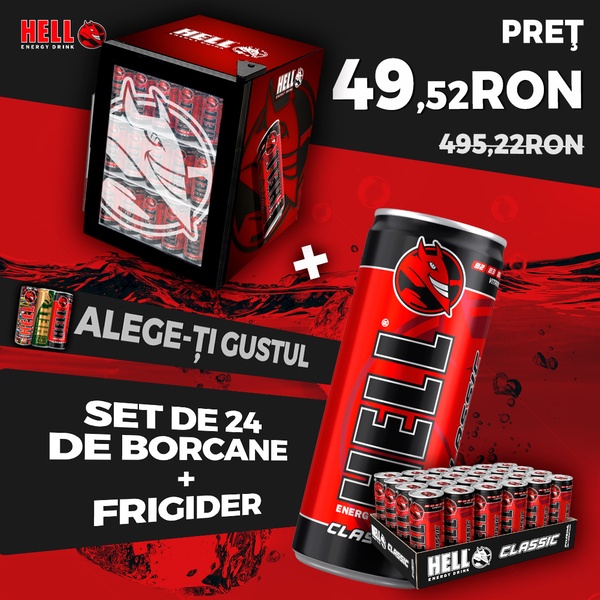


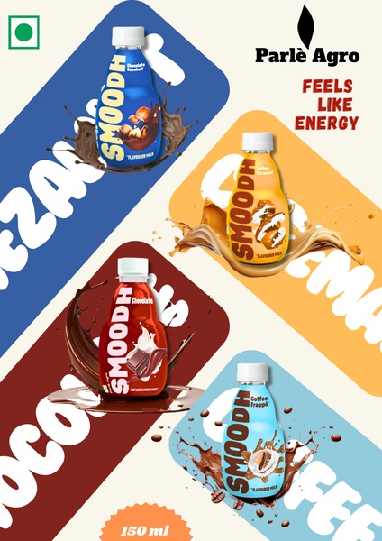









Promer helps you find the pattern, adapt it to your product, and create your own version in minutes.






