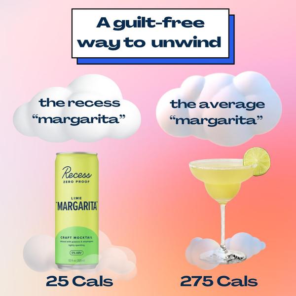
A split-screen comparison showing the calorie difference between a specialty mocktail and an average counterpart.
Free credits included. No card required
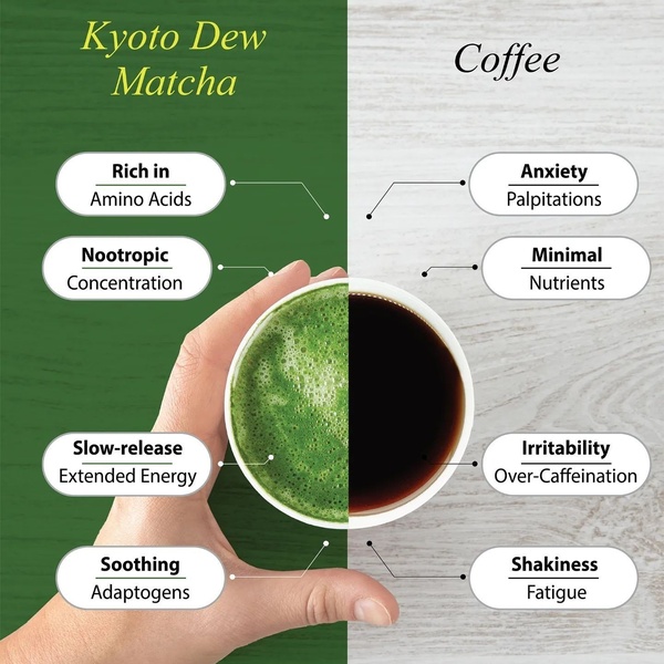
This creative utilizes a clear side-by-side comparison to position the mocktail as a superior choice, immediately addressing consumer pain points regarding sugar and calorie intake. By visualizing the 25 versus 275 calorie difference against a soft, gradient background, the ad turns a dry health claim into a compelling, easy-to-read visual story.
For most ecommerce beverage brands, using this structure via Promer AI creates instant mental anchoring that separates your product from standard market options. This pattern works because it respects the viewer's scroll speed, delivering the core benefit before the user has to process any secondary information.
Great ads start from a clear structure that makes your product's primary benefit impossible to miss at a glance.
Pro tip
When using a comparison hook for a new beverage, test one version focused on calories and another focused on sugar content to see which pain point resonates more. Ensure the 'average' comparison is based on a relatable category standard to maintain credibility.




Promer helps you find the pattern, adapt it to your product, and create your own version in minutes.






