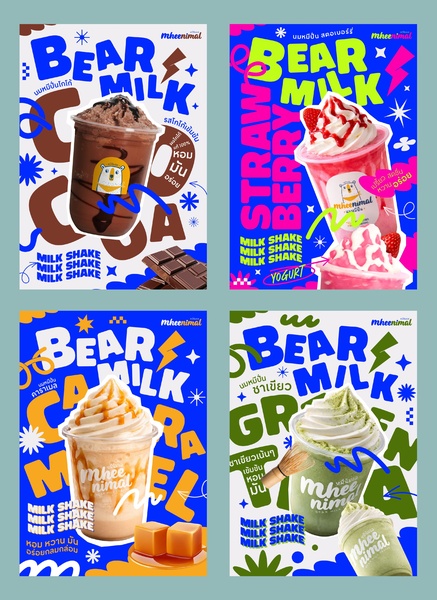
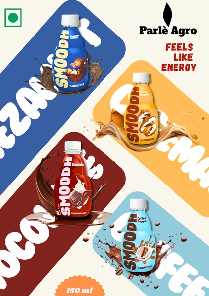
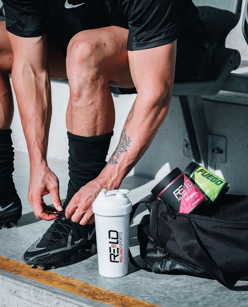
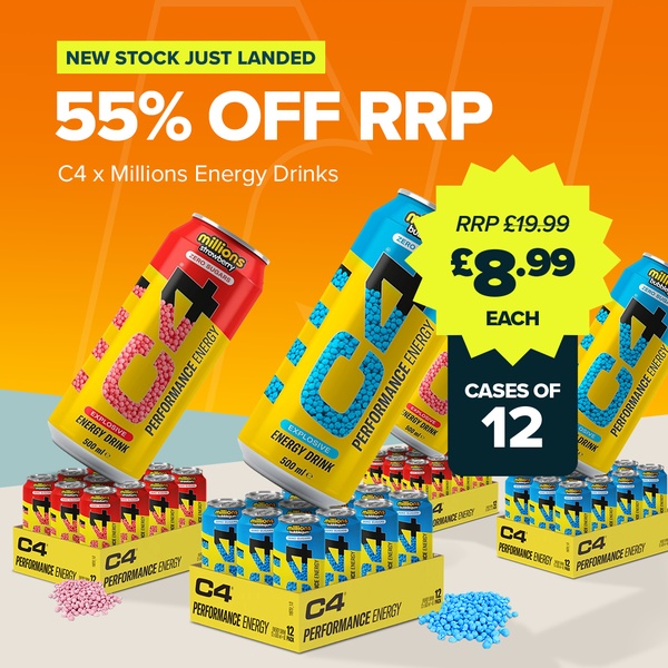
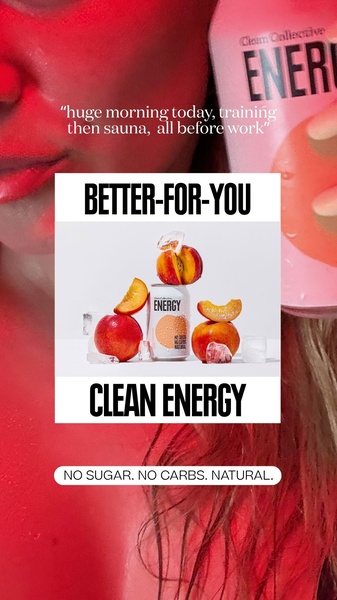
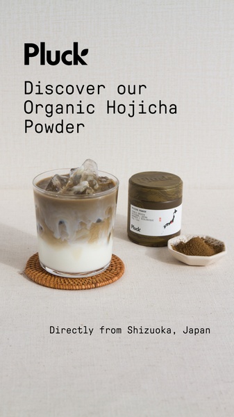
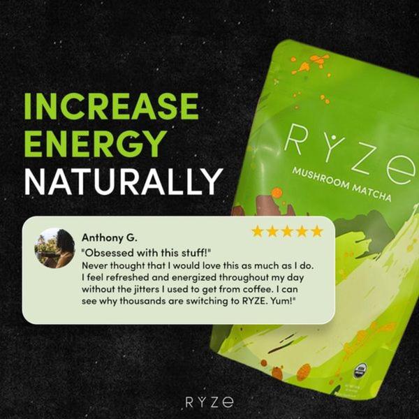
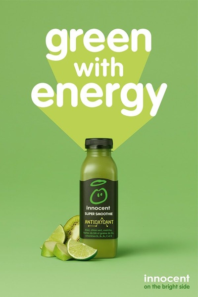
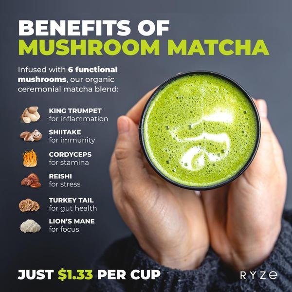
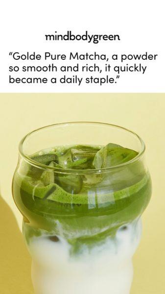
A collection of four vibrant, high-energy milkshake advertisements featuring bold typography, bright colors, and dynamic product shots for various flavors.
Free credits included. No card required
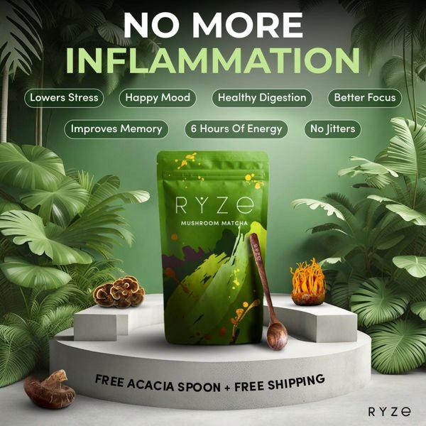
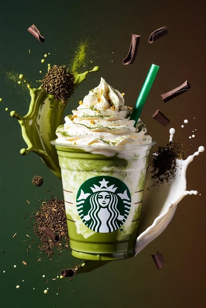
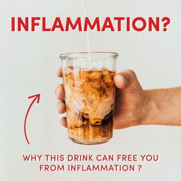
This milkshake ad series succeeds by using bold typography and punchy color contrasts to create an immediate, playful hook. By pairing a high-quality product shot with exaggerated graphic elements like lightning bolts and star bursts, the creative stops the scroll through sheer visual intensity and vibrant color layering. The combination of clear, oversized product labeling and a recognizable brand character establishes a strong, repeatable visual identity for the beverage.
For most food and beverage brands, this approach works because it simplifies the user's decision-making process through high-contrast visual cues. At Promer AI, we see that pairing a centered, appetite-appealing product hero shot with dynamic graphic overlays typically drives higher engagement for impulsive, snack-based purchases. This structure allows the creative to function across multiple product variants without losing its core, recognizable brand personality.
A high-converting ad relies on a consistent visual structure that makes your product the clear hero of the frame.
Pro tip
When using bold graphic overlays, ensure the typography does not physically intersect with the primary product image to maintain appetite appeal. Use your brand's secondary color palette for the graphic shapes to keep the visual hierarchy focused on the product itself.
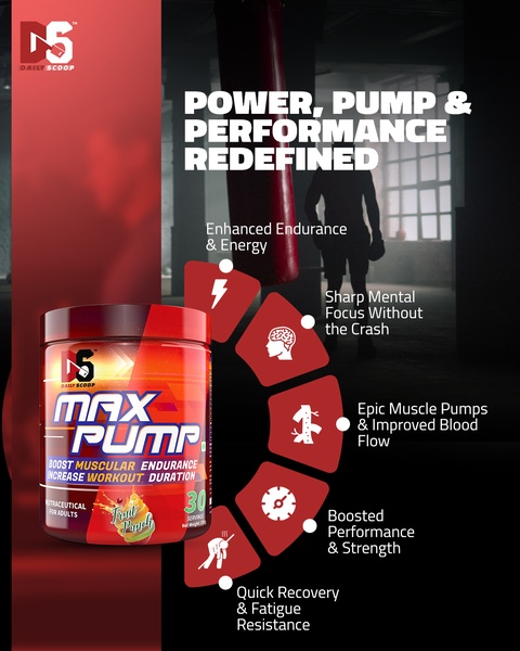
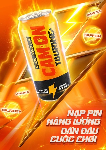
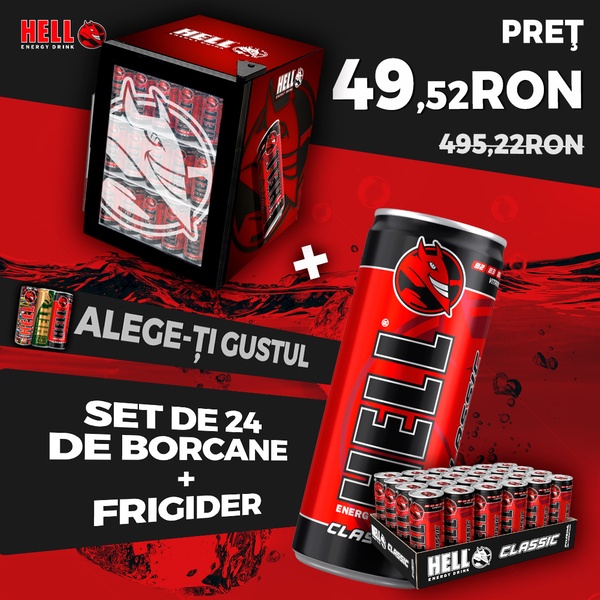




Promer helps you find the pattern, adapt it to your product, and create your own version in minutes.






