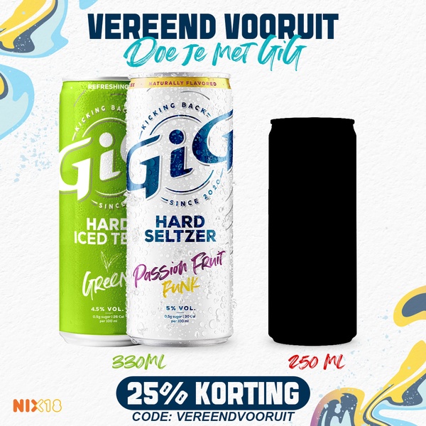
A clean, minimalist product comparison graphic showcasing two varieties of hard seltzer with a clear discount offer.
Free credits included. No card required
This hard seltzer creative succeeds because it immediately balances a clear value proposition with a clean product display. By presenting the product range alongside a strong, specific discount code, the brand uses visual symmetry to lower friction for the customer during their shopping journey.
For most brands, comparing products directly can often feel cluttered, but this layout succeeds by maintaining a unified aesthetic across variants. When you use Promer AI to replicate this structure, you focus on the product truth and the clear CTA, which typically helps in capturing attention during high-volume sale periods.
Great ads start from a clear structure that places your core value proposition in direct conversation with your product.
Pro tip
When testing comparison ads, ensure the silhouette of your secondary product is distinct enough to pique curiosity without distracting from the primary item. You can use this to drive interest in a bundle or a new flavor profile by suggesting the second option as a complementary choice.








Promer helps you find the pattern, adapt it to your product, and create your own version in minutes.






