
A clean, centered product photography shot of a single silver beverage can featuring a light blue label with bold, simple typography.
Free credits included. No card required
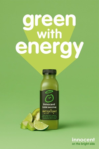
This creative focuses on a clean product presentation to anchor your sparkling water brand in a space of simplicity and mindfulness. By centering the product and using a restricted, soft color palette, the composition removes visual clutter, allowing the consumer to immediately grasp the identity and core benefit of the product without unnecessary distractions. The minimalist design approach leverages negative space to emphasize brand clarity.
For most ecommerce beverage brands, an uncluttered layout helps establish premium positioning, which is why Promer AI often recommends a singular, hero-product focus for initial market testing. This specific pattern works because it respects the consumer's short attention span while clearly communicating exactly what the product is, its primary ingredient, and its intended functional benefit.
A great ad starts from a clear vision of your product's core value, utilizing structure and space to tell a story that resonates instantly with your customer.
Pro tip
When using a centered product hook, test variations of the background color to see which tone better captures the energy of your specific ingredient profile. Keep your copy brief, mirroring the punchy, benefit-driven lines used here to ensure your message remains readable on mobile devices.
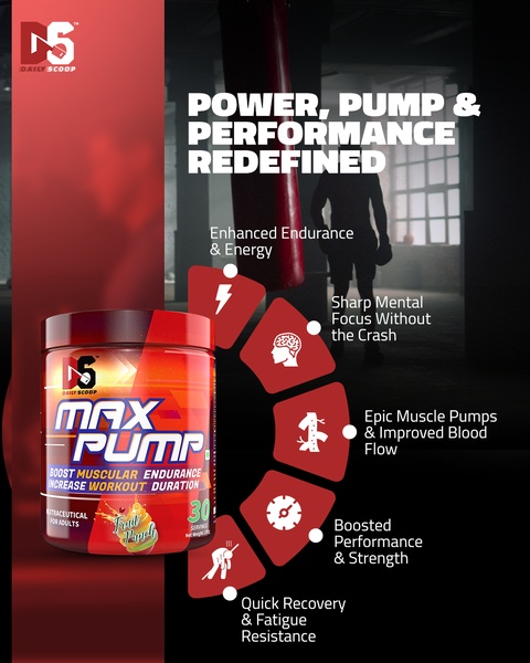

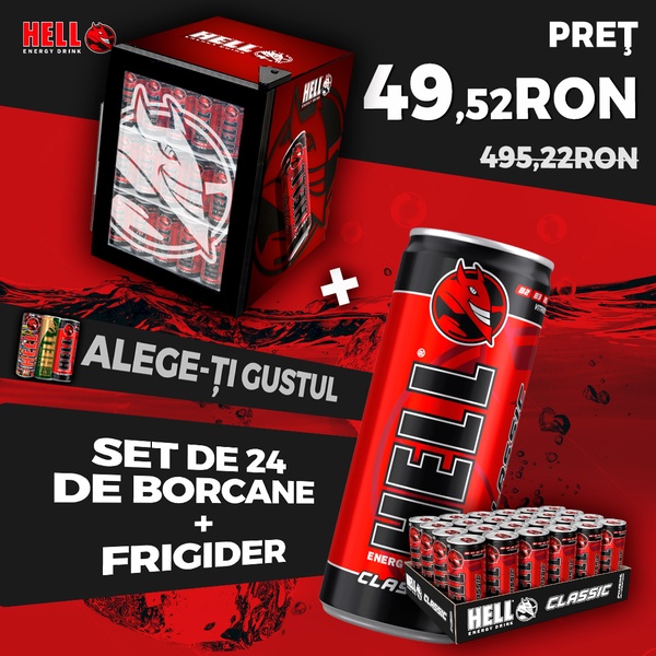


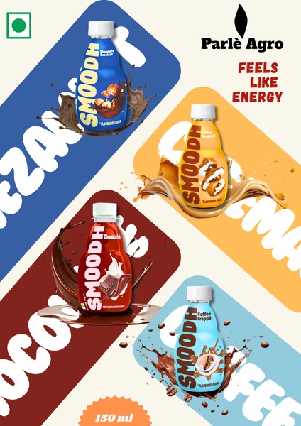




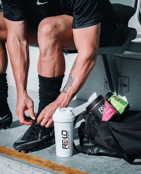

Promer helps you find the pattern, adapt it to your product, and create your own version in minutes.






