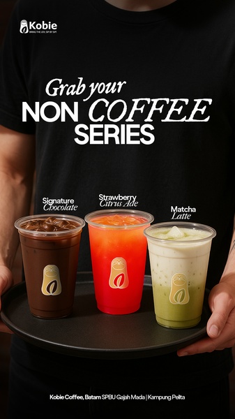
A close-up, high-contrast shot of a person holding a tray with three distinct non-coffee beverage options to highlight product variety.
Free credits included. No card required
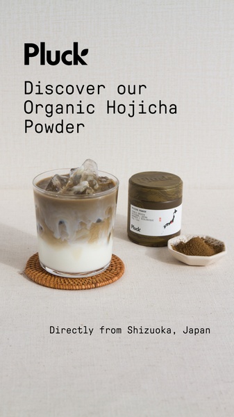
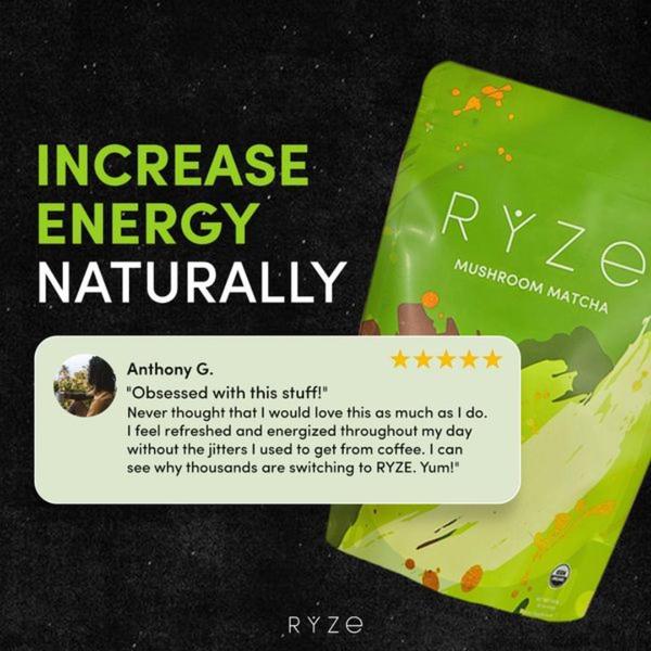
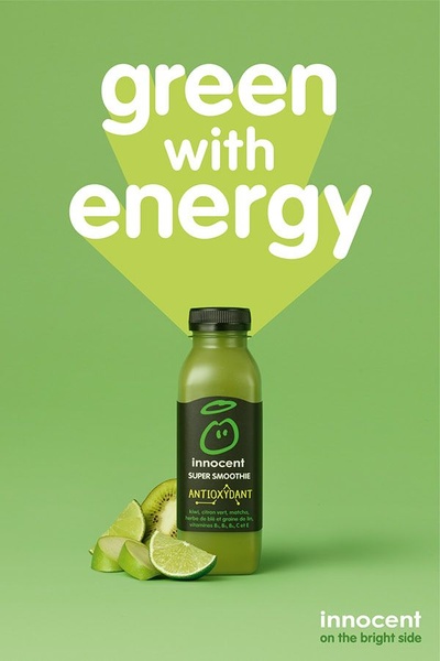
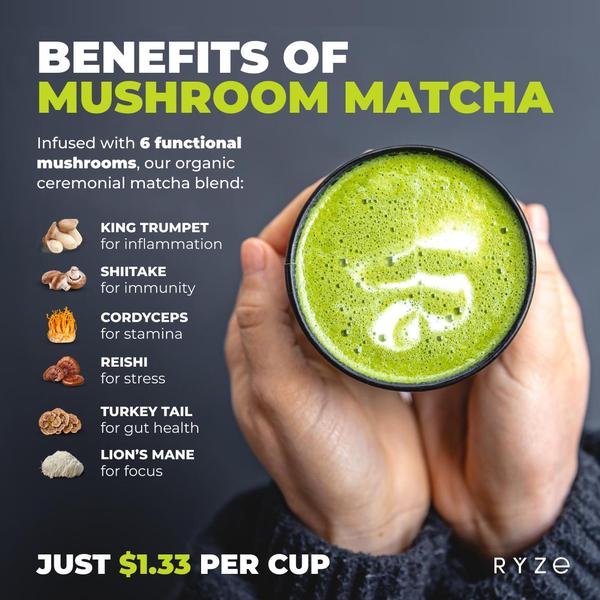
This beverage creative leverages a clear, high-contrast visual hierarchy to present multiple product SKUs simultaneously without visual clutter. By placing the text overlay centrally over a clean background, the brand ensures the core message remains the priority while the colorful drinks capture the viewer's immediate attention. This simple grid-like alignment creates a sense of variety and accessibility for the viewer. Using Promer AI to replicate this structured approach allows ecommerce teams to rotate seasonal menu items while maintaining a consistent visual brand identity across high-performing ad placements.
A powerful product ad anchors itself in a clean, consistent structure that allows the primary offer to speak for itself.
Pro tip
When showcasing multiple variants, ensure the color palette of your beverages provides enough contrast against your chosen background. This ensures that even on smaller screens, each item remains distinct and enticing to the viewer.
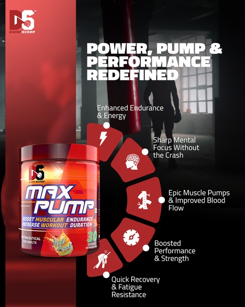

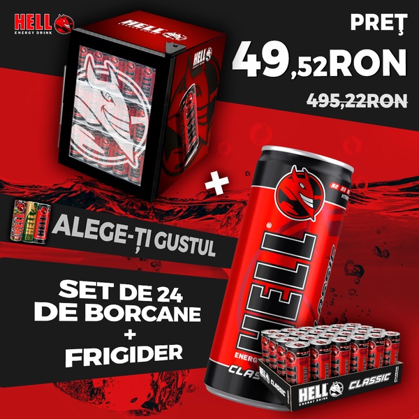


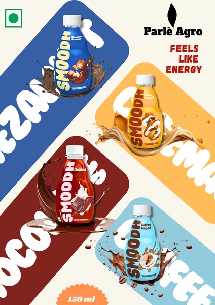




Promer helps you find the pattern, adapt it to your product, and create your own version in minutes.






