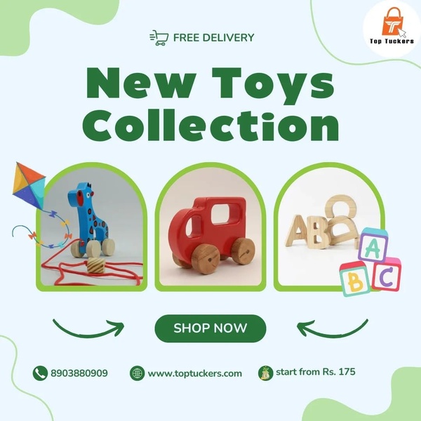
A clean 1:1 square display showing three distinct wooden toy items with a clear shop-now call to action and brand information.
Free credits included. No card required
This creative utilizes a clean, three-column layout to showcase the breadth of the new wooden toys collection without overwhelming the viewer. By organizing the product subject into distinct visual compartments, the ad immediately signals variety while maintaining a high level of aesthetic order that appeals to parents.
This structural approach allows for quick product recognition, a key factor for Promer AI users looking to highlight multiple SKUs in a single frame. In most cases, a clean, white-space-heavy design like this effectively lowers the friction for mobile users who expect simple, punchy visual information.
Great ads start from an idea, a feeling, or a structure, not a blank design.
Pro tip
If you have a larger catalog, use this layout for a 'best sellers' or 'new arrivals' collection rather than displaying unrelated items. This ensures the visual harmony remains intact, which is critical when your primary goal is to guide the user toward a single shop-now action.




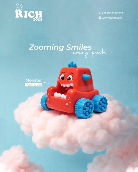



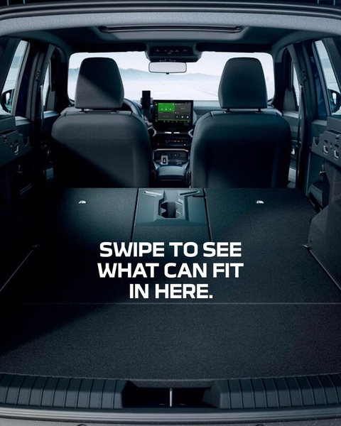











Promer helps you find the pattern, adapt it to your product, and create your own version in minutes.






