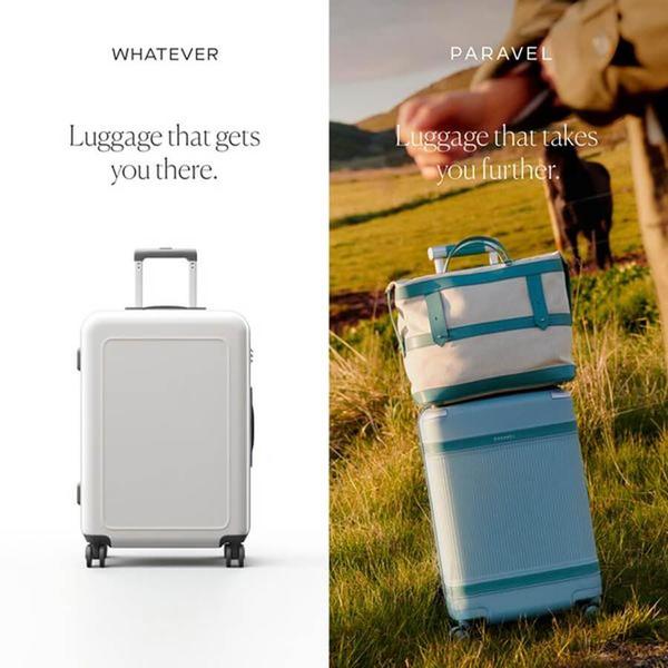
This creative uses a split-screen design to compare a generic suitcase to the brand's product, highlighting a shift from basic utility to an adventurous lifestyle.
Free credits included. No card required
The side-by-side split screen uses the contrast between utility and emotion to position the suitcase as a lifestyle upgrade rather than just a travel tool. By anchoring the 'Whatever' side in a sterile, white-background product shot and the 'Paravel' side in a warm, textured, natural setting, the ad immediately signals a difference in user experience and brand values.
A strong ad uses visual tension to make the viewer feel the difference between the commodity they have and the solution they need.
Pro tip
When using a comparison framework, ensure your 'standard' side still looks like a quality, credible product rather than something visibly broken. The goal is to highlight a difference in lifestyle or outcome, not just a difference in product quality.





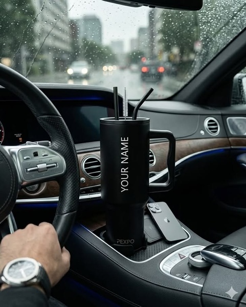


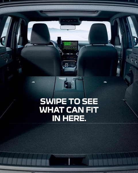





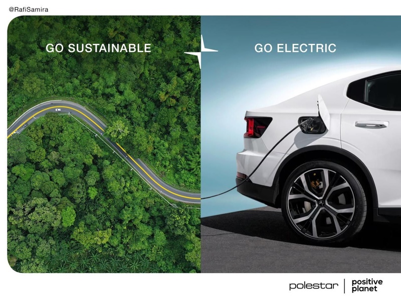




Promer helps you find the pattern, adapt it to your product, and create your own version in minutes.






