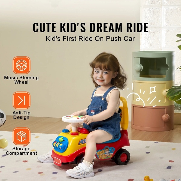
A square-ratio product advertisement featuring a child on a colorful push car, using orange icons to call out key functional features like music, anti-tip design, and storage.
Free credits included. No card required
This push car ad utilizes a clean, icon-centric visual layout to quickly communicate key product value propositions to busy parents. By isolating high-priority benefits with consistent, high-contrast orange icons against a simple background, the ad effectively forces the viewer to process the toy's core features in seconds.
For most ecommerce brands in the juvenile category, this approach minimizes cognitive load while building immediate product trust. You can easily replicate this high-conversion hierarchy using Promer AI to ensure your own product shots maintain a clean, readable layout that highlights technical features without feeling cluttered.
Great ads start from an idea, a feeling, or a structure, not a blank design.
Pro tip
When using icon overlays, ensure your icons are uniform in shape and color to maintain a professional, minimalist look. Varying icon colors can create visual fatigue, so keep your callouts strictly branded for better retention.





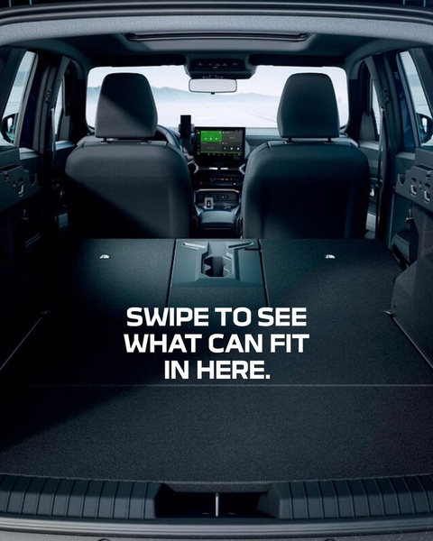



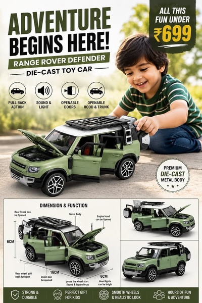

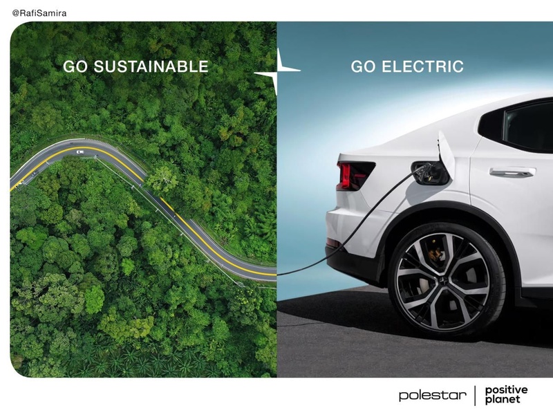


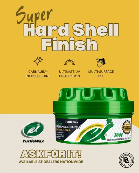
Promer helps you find the pattern, adapt it to your product, and create your own version in minutes.






