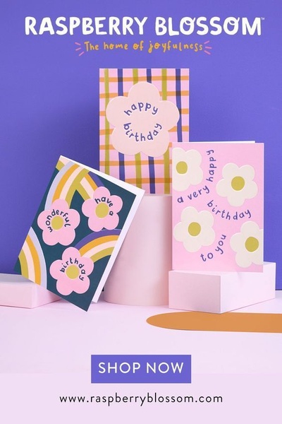
A clean, studio-lit hero shot featuring three distinct greeting card designs on minimalist pedestals, emphasizing color and pattern.
Free credits included. No card required
This greeting card ad creative excels by leveraging a high-contrast, studio-lit aesthetic that puts the product's design at the center of the frame. The strategy relies on a clean, pedestal-based hero shot that highlights multiple designs at once, making it ideal for showcasing a new collection or brand variety. By using vibrant, complementary color backgrounds, the creative creates an immediate, optimistic visual impact that stops the scroll through sheer color harmony and simple, balanced composition.
For most ecommerce teams, this approach works because it allows the product to speak for itself without clutter. When you use Promer AI to replicate this structure, you focus your customer's attention directly on the product's physical details rather than aggressive sales copy. Keeping the messaging light and joyful, as seen in this example, typically builds better brand affinity than high-pressure conversion tactics in the gifting category.
Great ads start from a balanced visual structure that allows your product design to communicate its own value proposition.
Pro tip
Vary the heights of your product pedestals to guide the viewer's eye in a Z-pattern across the ad. This keeps the design from feeling flat and helps each individual product get noticed within a single frame.


















Promer helps you find the pattern, adapt it to your product, and create your own version in minutes.






