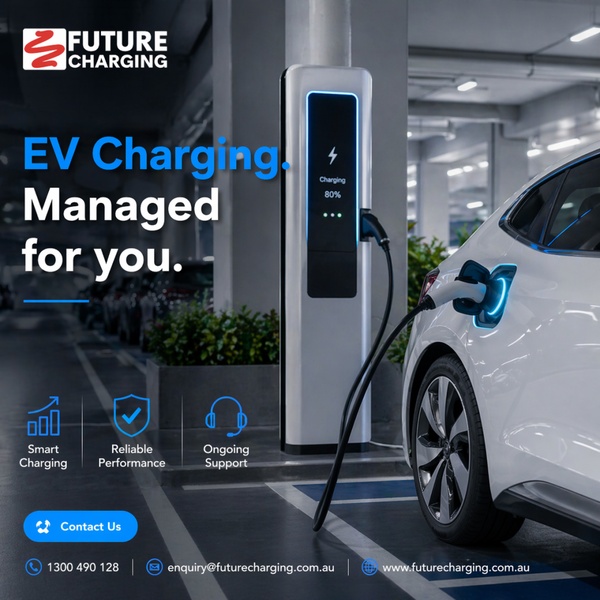
This creative showcases a professional, service-oriented approach to EV infrastructure, highlighting key benefits through icons and clear branding.
Free credits included. No card required
The primary value proposition of this charging station creative relies on a clean, benefit-first visual architecture that establishes immediate trust. By pairing a high-resolution, professional image of the product in action with clear icon-based feature callouts, the brand quickly signals reliability and ease of use to a target audience seeking a managed service rather than just hardware. The visual balance effectively highlights the service's utility without overwhelming the user with text, using a consistent blue accent color to guide the eye toward key messaging. This structure works exceptionally well for Promer AI users looking to professionalize their brand perception in high-involvement service industries. By stripping away visual clutter, the ad focuses entirely on the promise of 'managed' convenience, which addresses the primary friction point for potential customers who value peace of mind and operational support.
Great ads start from an idea, a feeling, or a structure, not a blank design.
Pro tip
When focusing on B2B or high-involvement services, choose iconography that directly addresses the customer's top three anxiety points. Testing these icon sets against abstract headers can often yield significant improvements in click-through rates.


















Promer helps you find the pattern, adapt it to your product, and create your own version in minutes.






