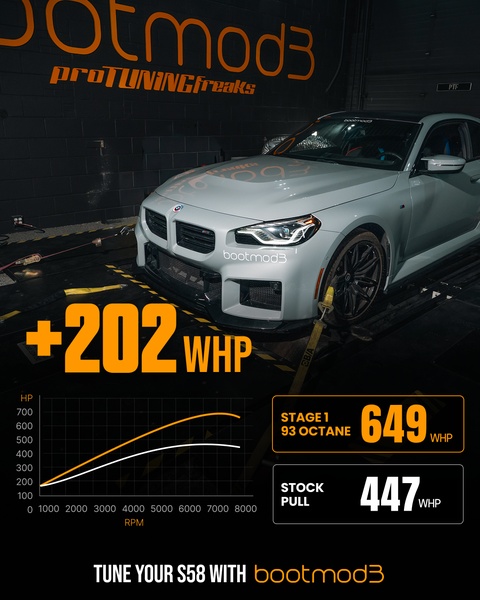
A technical breakdown showing a 202 WHP increase after applying performance software to a vehicle.
Free credits included. No card required
This ad works because it anchors the value of the car software in immediate, indisputable data. By presenting a clear 'Before vs. After' dyno graph, the creative removes guesswork and speaks directly to the performance-focused goals of the enthusiast demographic, leveraging objective quantitative proof to command attention in a crowded feed.
For most brands in the automotive space, this approach creates an instant sense of authority that emotive lifestyle imagery often fails to replicate. By using Promer AI to structure your results-based creatives, you can ensure your data is presented with the same clarity, allowing your unique performance gains to drive high-intent engagement from users who value cold, hard numbers.
Numbers do not lie; when you demonstrate clear performance gains, you allow the data to do the selling for you.
Pro tip
When showcasing technical data, keep your graph labels as simple as possible. Ensure the most impressive metric is the largest element on the screen so that even a quick scroll-by delivers the core value proposition.





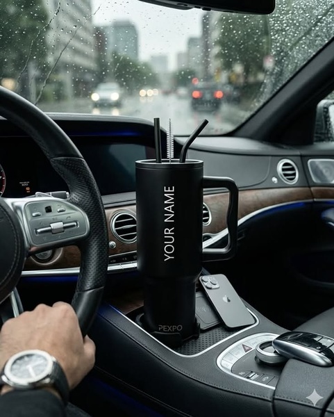


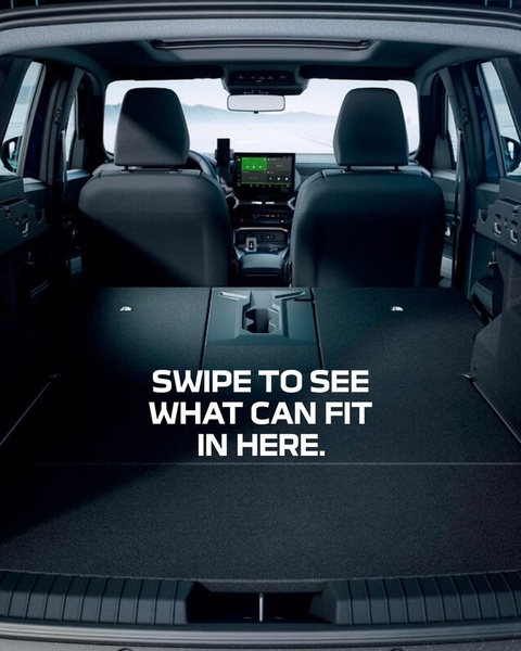





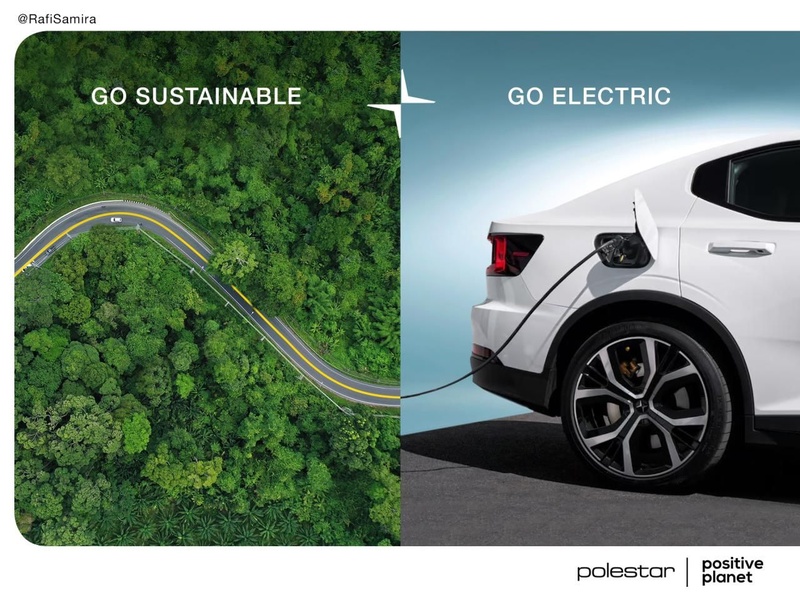





Promer helps you find the pattern, adapt it to your product, and create your own version in minutes.






