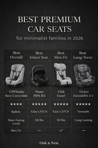
A clean, comparative layout showcasing four premium car seats side-by-side using a dark, minimalist aesthetic to emphasize premium product features.
Free credits included. No card required
This ad works because it uses a structured comparison grid to simplify complex decision-making for a high-involvement car seat purchase. By positioning multiple options against clear, benefit-driven headers, the brand creates a helpful, authoritative resource that respects the consumer's time and intelligence.
For performance marketers on Promer AI, this pattern demonstrates how to leverage visual hierarchy to reduce friction. In most cases, distilling product variations into a clean, easy-to-read table allows potential customers to identify their preferred model at a glance without feeling overwhelmed by technical specifications.
Great ads translate technical product data into an intuitive visual story that empowers the customer to choose the best solution for their needs.
Pro tip
Focus on consistent criteria across all items in your grid to make the comparison feel objective and helpful. If one item lacks a specific feature, use a neutral indicator like a dash rather than simply leaving it blank to maintain the visual alignment.



















Promer helps you find the pattern, adapt it to your product, and create your own version in minutes.






