
A magazine cover featuring an airplane window view with multiple callouts connected to specific content pages.
Free credits included. No card required
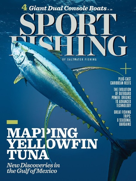
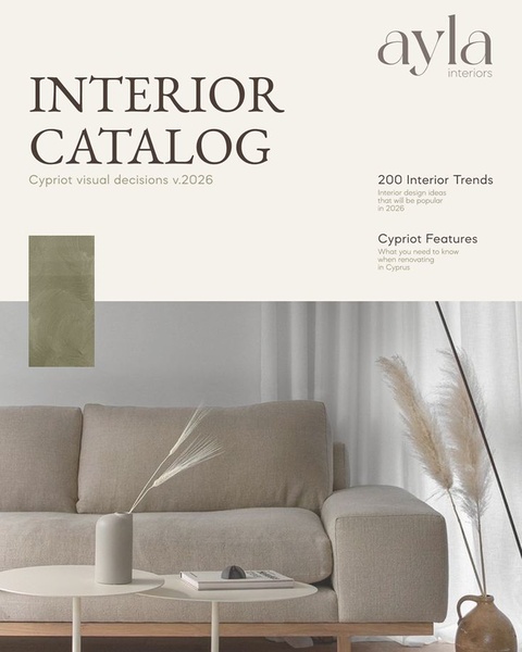
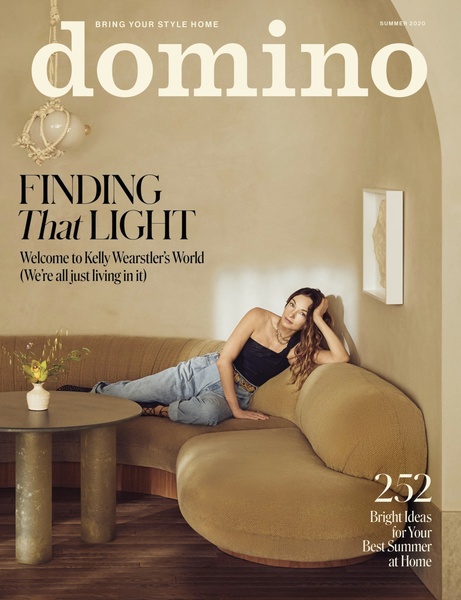
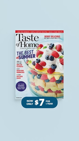
This magazine cover ad creative succeeds by using a high-contrast, minimalist visual window to draw the eye directly to the center, creating a strong focal point. By utilizing an editorial layout that overlays distinct headlines directly onto a clean, aspirational image, the design forces the viewer to process multiple value propositions within a single, cohesive frame.
This structure effectively organizes complex information by using clean paths to guide the user's focus, a pattern often leveraged by Promer AI users to declutter their messaging. In most cases, this approach works because it signals authority and premium value, which is useful when you have multiple product features to highlight without appearing overwhelming.
Great ads start from an idea, a feeling, or a structure, not a blank design.
Pro tip
When using multiple callouts, keep the number of points to four or fewer to avoid cognitive fatigue. Ensure each headline is short enough to be read in under two seconds to maintain the clean, premium feel of the editorial style.








Promer helps you find the pattern, adapt it to your product, and create your own version in minutes.






