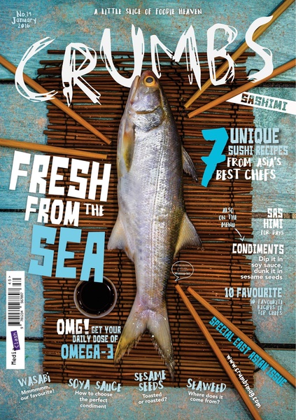
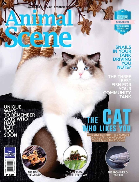
A top-down, high-contrast flat lay of a fresh fish on a bamboo mat, designed as a magazine editorial cover with multiple sub-headline text blocks.
Free credits included. No card required
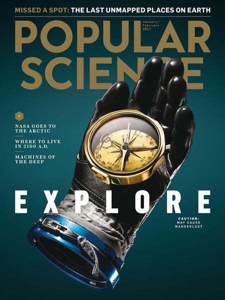
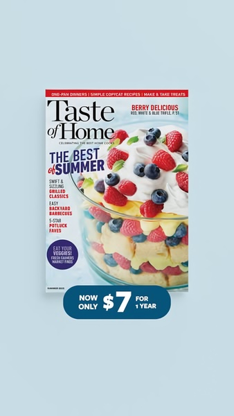
This fish magazine ad creative uses a high-contrast, top-down flat lay to establish immediate visual authority by focusing on the raw ingredient. By combining an editorial-style cover layout with benefit-led subheads, the design forces the viewer to treat an ad like an informative content piece, effectively reducing platform friction.
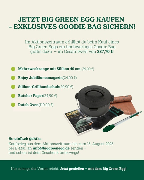
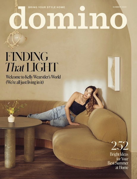
This structure thrives because it mimics high-value editorial content rather than a traditional hard-sell, which often suffers from banner blindness. Using Promer AI allows performance marketers to emulate this structured layering, ensuring that even if your product category differs, you can replicate the grid-based copy hierarchy that keeps eyes moving across the image.
Great ads treat the viewer as an intelligent reader, providing layers of value rather than a single, aggressive sales pitch.
Pro tip
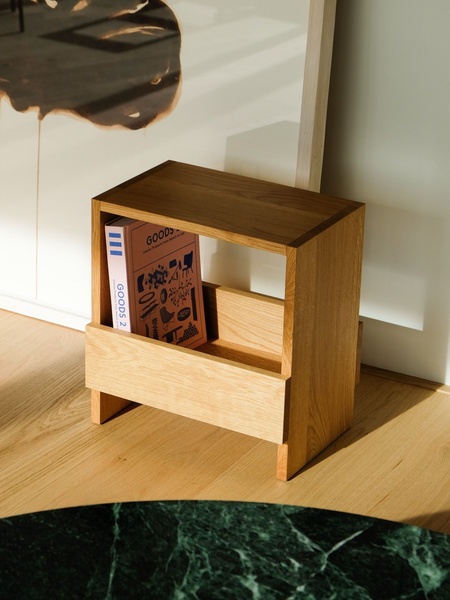
To make a flat-lay design work for e-commerce, ensure your product is the sharpest element in the frame, while background textures like the bamboo mat remain slightly softer. This depth of field forces the eye toward the product and away from the peripheral typography, allowing you to control the viewer's reading order.









Promer helps you find the pattern, adapt it to your product, and create your own version in minutes.






