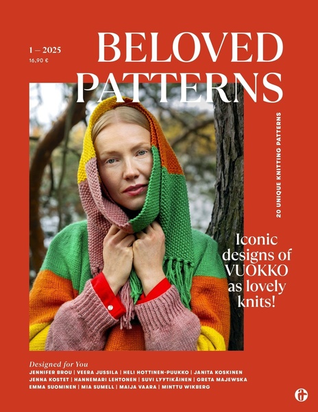
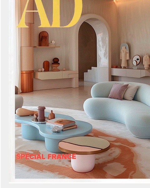
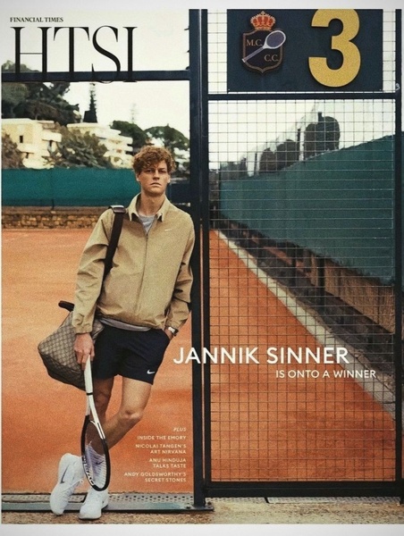
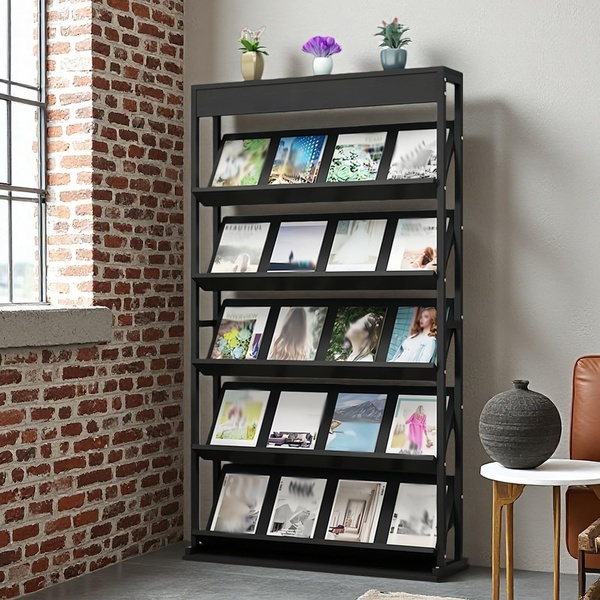
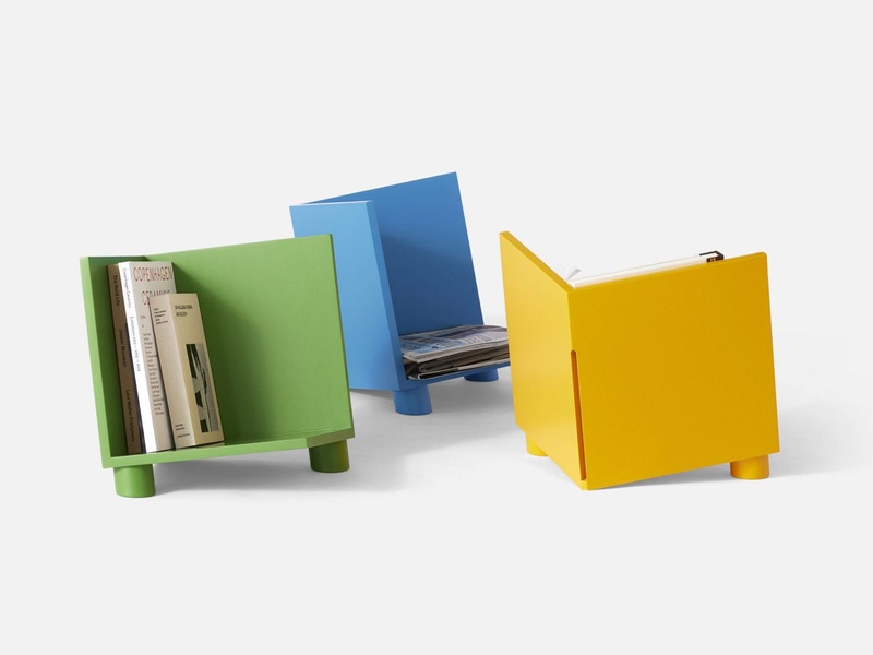
A 4:5 editorial style ad for a knitting patterns magazine, featuring a central product focus with bold typography and clear branding.
Free credits included. No card required
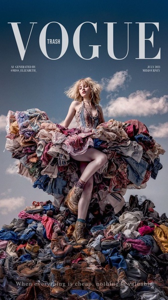
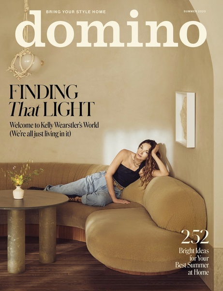
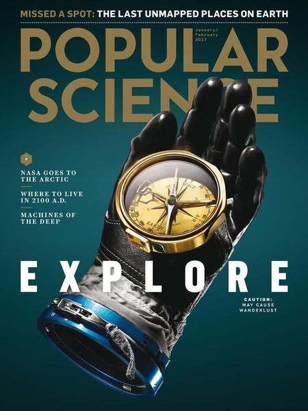
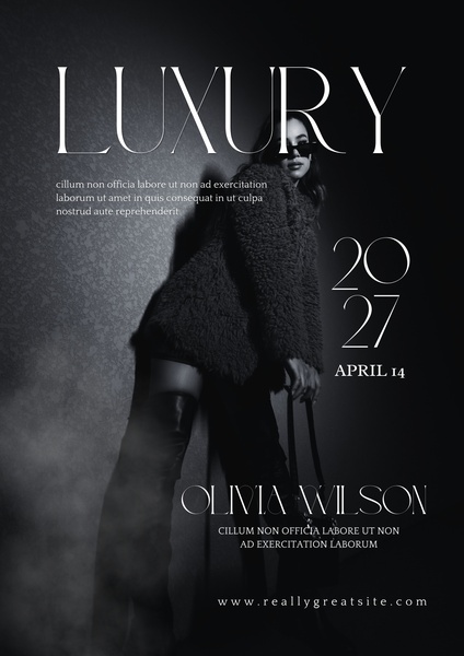
This knitting pattern magazine ad creative leverages a high-contrast editorial aesthetic to stop the scroll. By placing the product in a relatable, cozy setting and using clean, bold typography to frame the central subject, the brand establishes immediate visual authority and a clear value proposition for the target audience. The power of this layout lies in its ability to blend product utility with lifestyle aspiration in a single, uncluttered focal point.
For most brands, keeping the creative centered on the tangible results of their service creates trust. Promer AI allows teams to analyze these structural choices and apply them to their own product categories, ensuring that the visual hierarchy remains the priority rather than secondary design elements. This approach typically performs well when the product itself is the hero and requires a high-quality display to justify its purchase intent.
Great ads start from an idea, a feeling, or a structure, not a blank design.
Pro tip
When mimicking an editorial style, ensure your typography does not compete with the product image. Keep the text elements anchored to the edges of the 4:5 frame to maintain a balanced, professional look that doesn't distract from your primary focus.
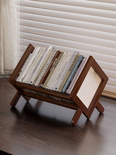
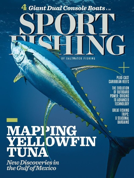
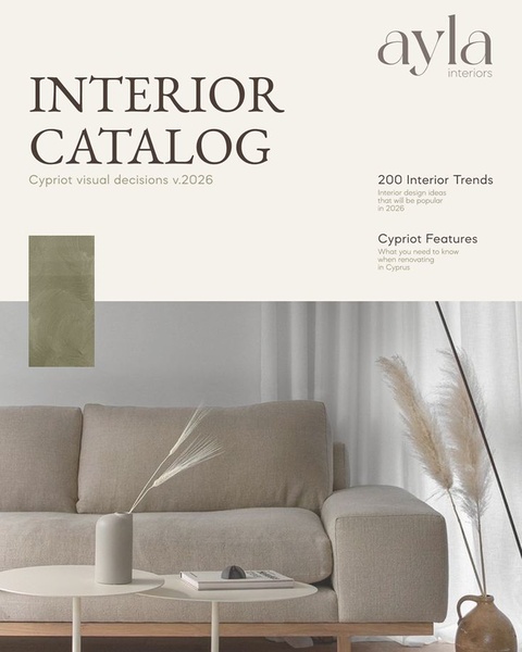
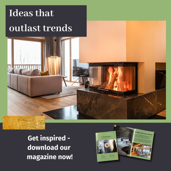
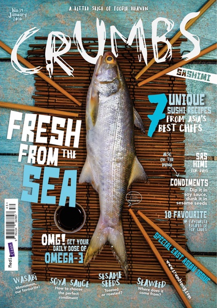

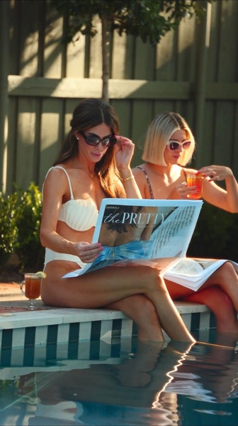
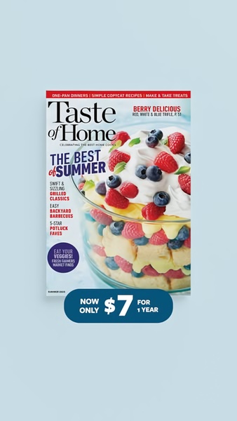
Promer helps you find the pattern, adapt it to your product, and create your own version in minutes.






