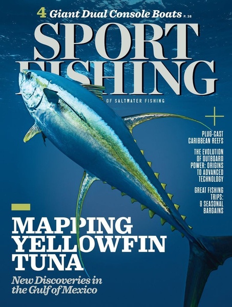
A high-impact 3:4 magazine cover style creative featuring a large yellowfin tuna against a deep blue ocean background, utilizing bold typography.
Free credits included. No card required
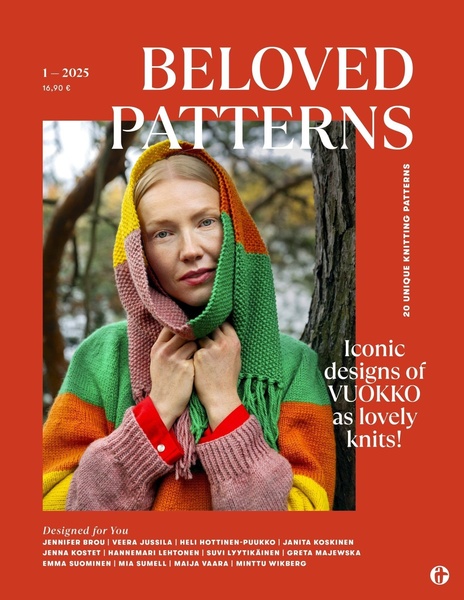
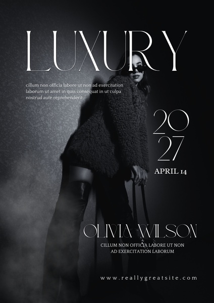
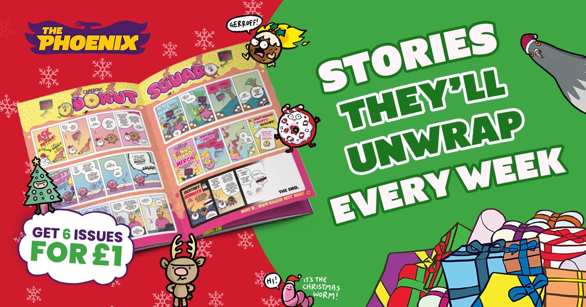
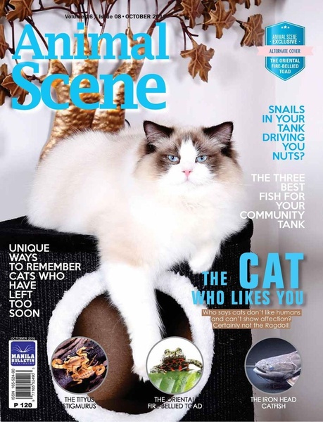
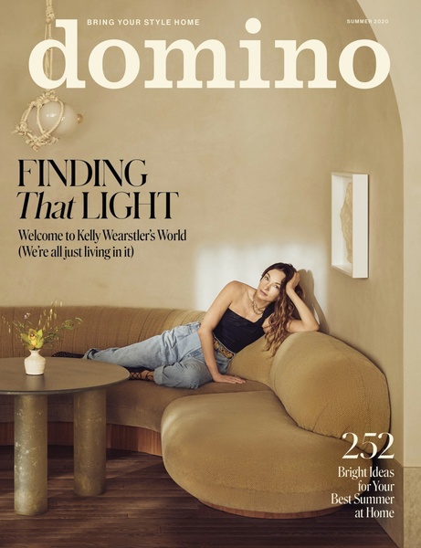
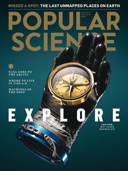
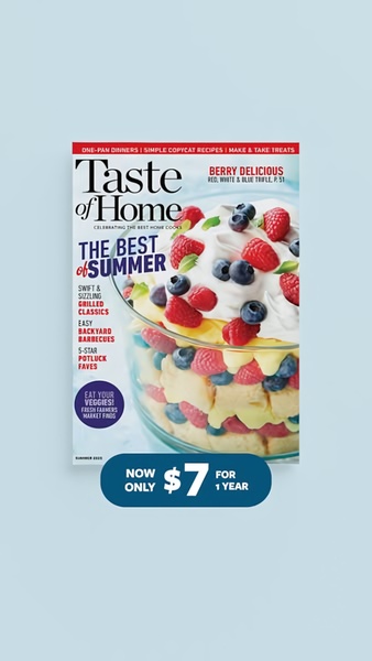
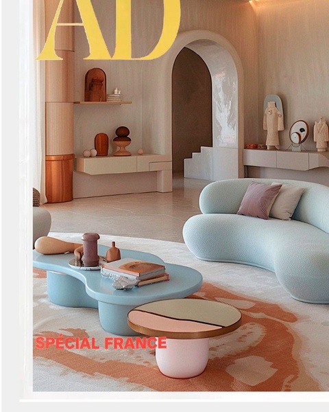
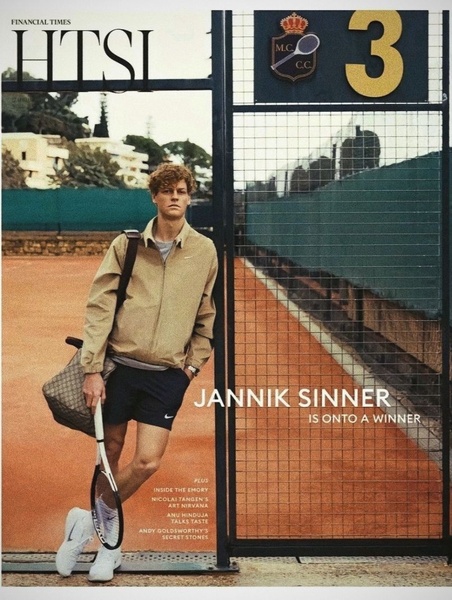
This yellowfin tuna ad creative succeeds because it adopts the high-authority aesthetic of a specialized niche publication to capture immediate viewer attention. The design uses a clean, editorial hierarchy that prioritizes the subject matter through a large-scale visual and bold, structured typography, effectively positioning the product as an expert-backed resource rather than a generic promotional post. By using this magazine-cover format, the ad builds trust and perceived value through association with premium print quality. Using Promer AI to replicate this structured approach can help you maintain high engagement rates by providing users with credible, information-dense content that feels native to their feed while maintaining a distinct, high-quality visual presence.
Great ads start from an idea, a feeling, or a structure, not a blank design.
Pro tip
When using an editorial style, ensure your typography contrast is high to remain readable on mobile screens. A clear focal subject like this tuna works best when text does not obscure the primary visual, allowing the brand to appear as an expert in the niche.



Promer helps you find the pattern, adapt it to your product, and create your own version in minutes.






