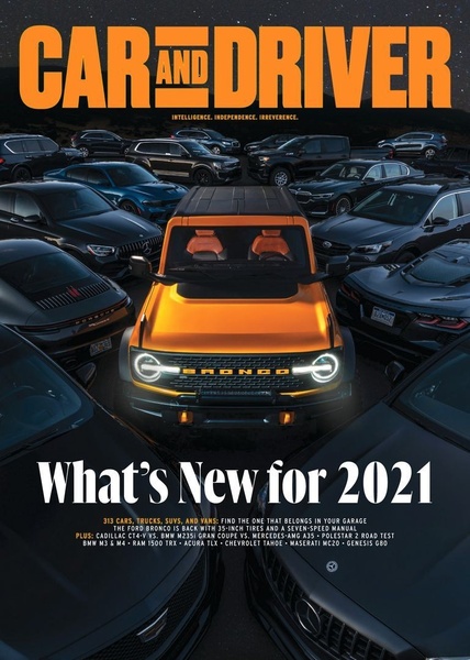
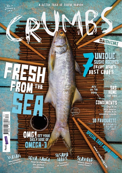
A high-impact magazine cover design showcasing a hero product surrounded by a competitive landscape of secondary vehicle models.
Free credits included. No card required
This car ad creative leverages a bold editorial layout to immediately establish authority and command viewer attention. By placing the hero vehicle at the dead center of a sea of secondary products, the ad creates an irresistible visual hierarchy that reinforces the dominance of the primary subject. This strategy uses contrast and scale to direct the eye exactly where the advertiser wants it, preventing the clutter of multiple models from diluting the brand message.
For most automotive marketing, this editorial approach succeeds by positioning the featured product as the solution among a sea of competitors. You can emulate this structure using Promer AI to analyze how visual weight is distributed in your own product imagery. By maintaining this level of intentional composition, brands can significantly reduce scroll-through rates and capture high-intent interest before the reader even scans the headline.
A truly effective ad creates a destination for the eye, turning a busy visual landscape into a clear, single-minded narrative.
Pro tip
When using a busy background to frame your product, ensure the hero item is significantly brighter or warmer in tone to maintain focal dominance. If your product lacks this contrast, use an overlay or lens flare effect to artificially boost its visual weight against the background.










Promer helps you find the pattern, adapt it to your product, and create your own version in minutes.






