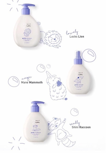
A clean, studio-lit display showing a shampoo, detangler, and conditioner paired with playful animal illustrations to build brand character.
Free credits included. No card required
The childrens hair care ad creative utilizes a playful, character-led hook to humanize functional product bottles. By pairing each item with a specific animal illustration and whimsical naming, the brand immediately establishes an approachable, gentle identity that resonates with parents looking for safe, kid-friendly grooming solutions. This visual-first approach minimizes text clutter, allowing the product identity to speak directly to the target demographic's desire for simplicity and joy in daily routines.
This specific layout relies on negative space and consistent branding, which is a powerful pattern for premium Promer AI users looking to maintain a clean aesthetic while highlighting multiple product features. For most ecommerce teams, stripping back the background ensures the packaging remains the hero, provided the supporting icons stay consistent with the brand voice. In some cases, using such minimal compositions requires strong secondary visual cues, like these simple line-art characters, to maintain engagement during the initial scroll.
Great ads start from an idea, a feeling, or a structure, not a blank design.
Pro tip
When adopting a minimalist style for personal care, always ensure your packaging hierarchy remains consistent if you are featuring multiple products. Use unique secondary icons or characters to differentiate SKUs, which helps customers navigate your range at a glance during high-speed scrolling.


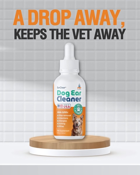
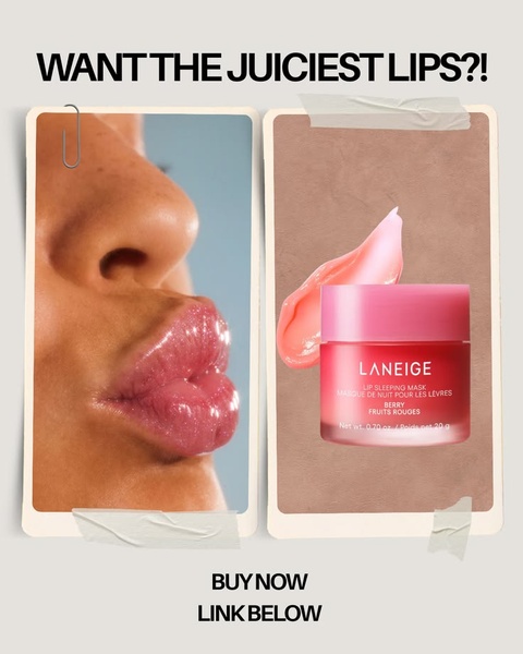
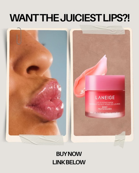
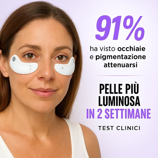

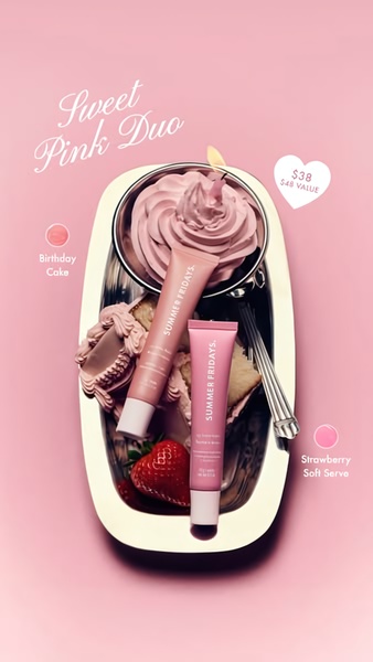
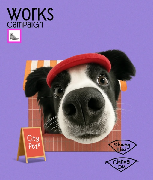

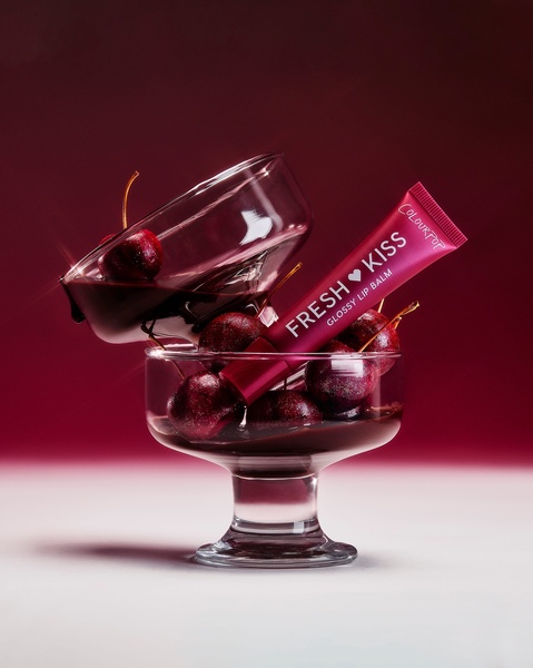
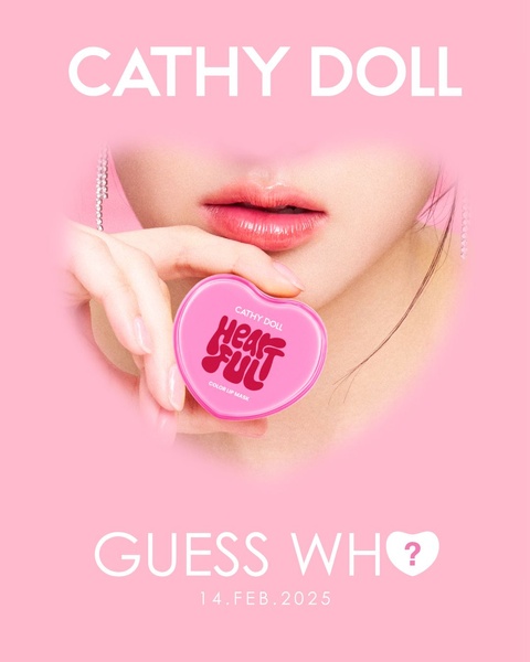

Promer helps you find the pattern, adapt it to your product, and create your own version in minutes.






