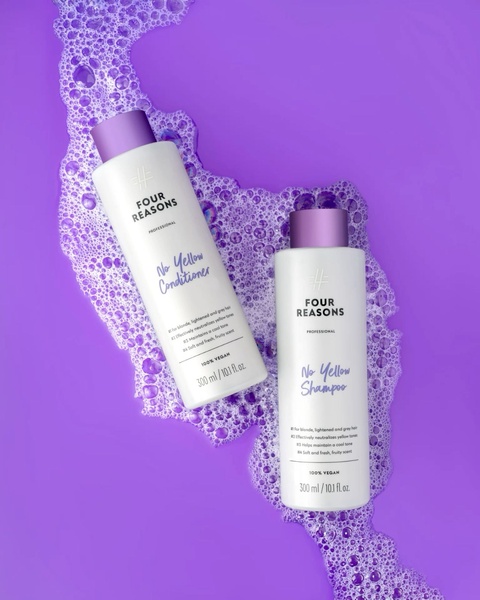
A high-contrast, overhead studio shot featuring purple shampoo and conditioner bottles resting in a vibrant purple foam bath.
Free credits included. No card required
This shampoo ad creative relies on bold color immersion to stop the scroll. By matching the product bottle labels to the background foam color, the image creates an instant association between the product and its primary benefit—neutralizing yellow tones—before the viewer even reads a single word. Visual clarity and direct color cues are the most effective ways to communicate product utility in crowded social feeds.
For many ecommerce brands, relying on heavy text overlays can create banner blindness; this design proves that a clean, product-first approach can be more effective when using Promer AI to maintain high-quality aesthetic standards. The 4:5 ratio maximizes screen real estate, ensuring the central focal point of the bottles remains prominent while the surrounding foam adds a sensory element that feels fresh and inviting to the target customer.
Great ads start from an idea, a feeling, or a structure, not a blank design.
Pro tip
When advertising hair care products, consider mirroring the background texture to the active ingredient or the core benefit—in this case, using purple to represent the neutralization of brassiness. This subconscious signaling works better than technical claims because it speaks directly to the visual results your customers are seeking.



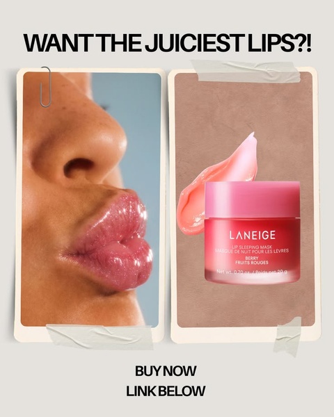
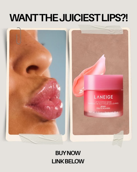
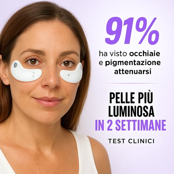

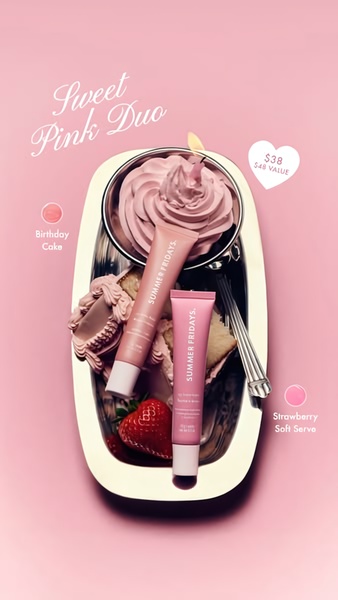




Promer helps you find the pattern, adapt it to your product, and create your own version in minutes.






