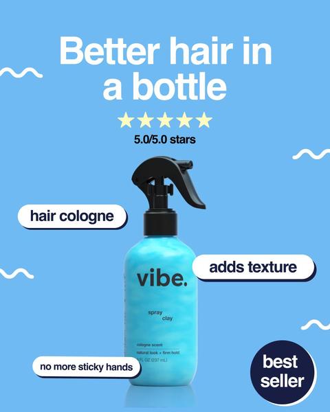
A clean 1:1 square graphic using a blue background and floating labels to highlight product features like texture and ease of use.
Free credits included. No card required
This spray clay ad creative uses a high-contrast label overlay strategy to educate the customer instantly without needing a full-length video. By pairing a simple product image against a calm, consistent background, the design focuses entirely on the core benefits of the formula, such as texture and ease of use, which minimizes cognitive load for the viewer. Using a clean visual hierarchy with descriptive labels is a proven method for high-converting social media creative.
This minimalist pattern works for most ecommerce teams because it allows for rapid testing of different value propositions without requiring expensive production, a core capability of Promer AI. In most cases, a direct, benefit-first approach outperforms cluttered creative because it respects the user's short attention span while scrolling through their feed.
Great ads start from an idea, a feeling, or a structure, not a blank design.
Pro tip
Instead of describing the product broadly, use your labels to call out a common pain point that the competition ignores. For example, if your product is a spray clay, explicitly addressing 'no more sticky hands' creates a strong competitive advantage in the customer's mind.

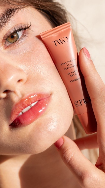
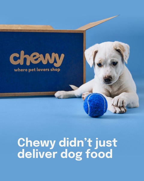




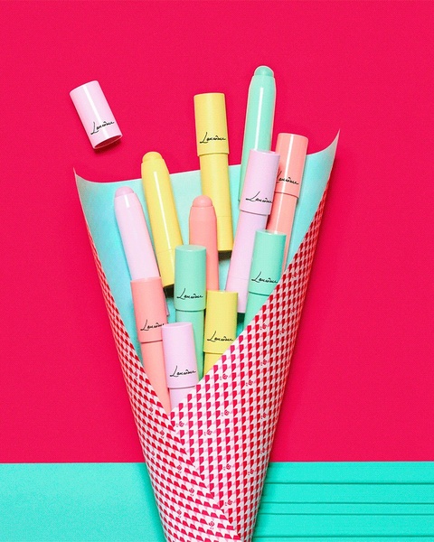

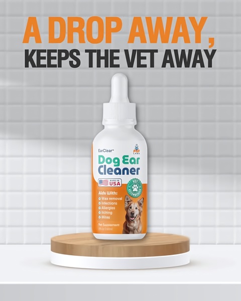







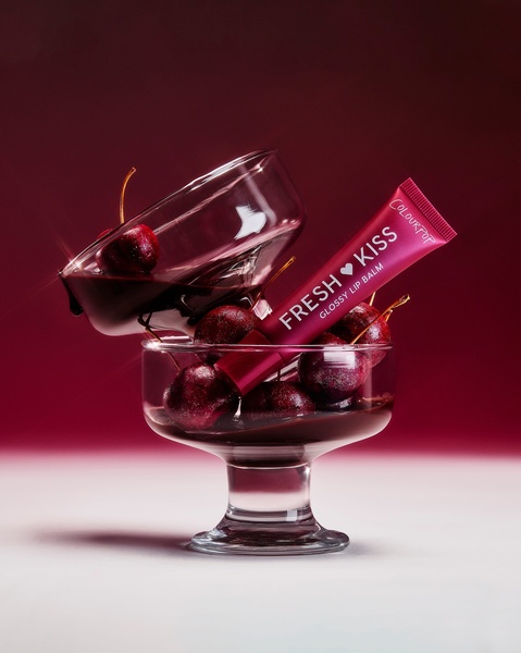


Promer helps you find the pattern, adapt it to your product, and create your own version in minutes.






