
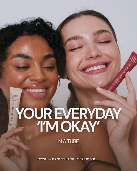
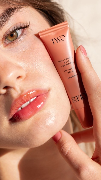
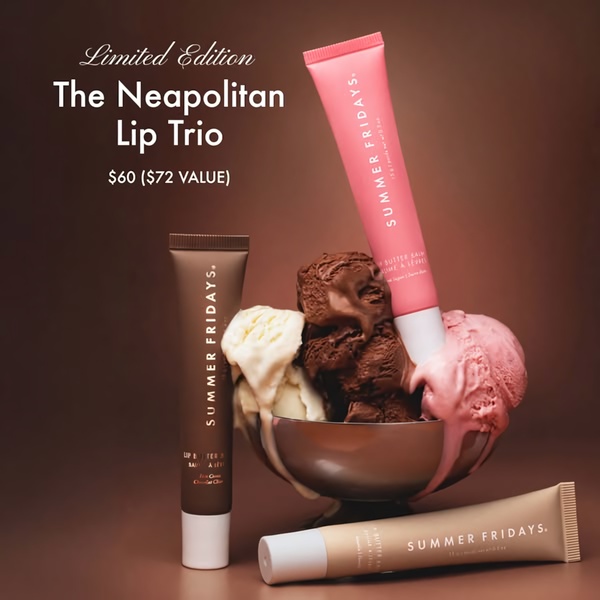
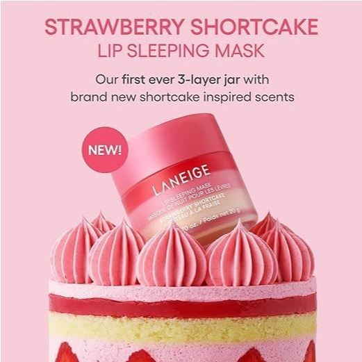
A vertical 9:16 creative showcasing multiple skincare bottles in a clean, organized grid layout with a prominent 20% discount offer.
Free credits included. No card required
This skincare product ad creative uses a clean, minimalist grid layout to present a clear 20% discount offer, effectively removing visual clutter to prioritize the promotion. By anchoring the brand around a crisp, clinical aesthetic, the ad builds immediate trust through simplicity and organized product placement. The core strategy here relies on using a high-contrast discount banner to drive immediate attention while maintaining a premium brand perception. For most beauty brands, this balanced approach helps lower friction between the discovery of a product and the decision to purchase. You can leverage the Promer AI platform to dissect this visual hierarchy and rebuild it for your specific inventory.
Great ads are built on a foundation of visual clarity where the value proposition is as obvious as the product identity.
Pro tip
When using a grid layout, ensure your best-selling product occupies the largest or most central visual space. This maintains a primary focus while allowing secondary products to support the overall brand breadth without confusing the user.









Promer helps you find the pattern, adapt it to your product, and create your own version in minutes.






