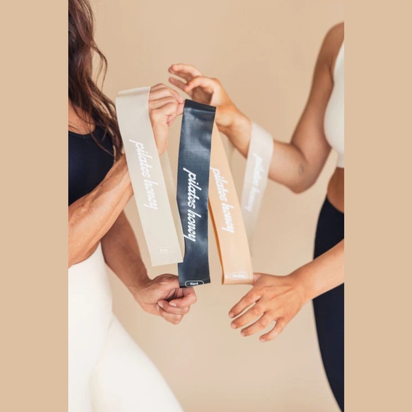
This creative showcases three different resistance bands held by users against a neutral, beige background to emphasize product variety and quality.
Free credits included. No card required
This resistance band ad creative utilizes a high-contrast, minimalist visual hook to ground the viewer immediately in the physical product. By placing the resistance bands in the center of the frame against a neutral background, the brand removes all friction and focuses the user's attention on the product's quality, texture, and variety. The strategy here is to rely on clean composition rather than cluttered call-outs to build immediate brand authority and perceived product value.
For most ecommerce teams, this pattern works because it aligns with a sophisticated audience that prefers clarity over aggressive sales pitches. You can achieve this same high-conversion layout by using Promer AI to standardize your own product photography across your existing catalog. In most cases, maintaining a consistent aesthetic across your ad suite helps lower acquisition costs by reinforcing your visual identity in every scroll.
A great ad starts from a refined visual structure that honors the product rather than hiding it behind excessive marketing noise.
Pro tip
When using this minimalist, neutral aesthetic, ensure your product logo is as crisp and legible as the text seen here. A common mistake is using too much text; keep your headlines short to match the visual simplicity and allow the image to carry the weight of the ad.


















Promer helps you find the pattern, adapt it to your product, and create your own version in minutes.






