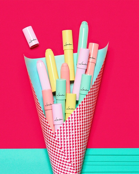
A horizontal 21:9 banner creative featuring a flat-lay arrangement of beauty and health products over a colorful, multi-layered background with a prominent sale offer.

Personal Care Clearance Sale Layout

A horizontal 21:9 banner creative featuring a flat-lay arrangement of beauty and health products over a colorful, multi-layered background with a prominent sale offer.

Ad Details
Style
Offer & Sale
Format
3:4
Industry
Hair Care
Platforms
Facebook Banner · Desktop Web
Language
English
Clone this ad with AI

Free credits included. No card required

Why this ad works

The personal care product ad creative utilizes a high-contrast, flat-lay arrangement to signal variety and accessibility while maintaining a clean aesthetic. By anchoring the visual weight with a bright teal background and layering product icons, the design effectively draws the eye toward the offer without creating visual fatigue for the viewer. This layout works because it balances product diversity with a clear, concise incentive that minimizes cognitive load for the consumer. Using Promer AI allows you to deconstruct such high-performing visual hierarchies and apply them to your own product inventory, ensuring your branding stays consistent even when highlighting multiple items in a single frame.

The winning ingredients

  • Offer Framing The clear 'Up to 75% Off' text serves as a direct incentive that occupies the high-visibility right-hand side of the banner.
  • Strategic Layout The 21:9 aspect ratio provides ample horizontal real estate to showcase a variety of items without overlapping or cluttering the central message.
  • Color Psychology The use of contrasting teal and yellow tones creates a vibrant, festive atmosphere that feels both urgent and welcoming to potential shoppers.
A winning clearance ad relies on the clean presentation of value rather than heavy, distracting graphic elements.

How to make it yours

  1. Begin by selecting the AI Ad Clone flow to analyze the structural composition of this banner.
  2. Paste your store URL so the platform can automatically map your specific product catalog and brand assets onto the layout.
  3. Adjust the copy to reflect your current seasonal offer and generate variations to find the perfect balance for your target audience.

Pro tip

When creating multi-product sale banners, ensure the products are arranged by size and color to create a balanced visual flow toward the CTA. Avoid cluttering the design with too many call-to-actions, as this can dilute the impact of your clearance pricing. A single, strong offer anchor is typically more effective than listing multiple secondary benefits.
Dog Joint Supplement Relief Sequence
NaturVet Cat Supplement Retail Ad
NaturVet Calming Chews Ad
Problem-Solution Ingredient-Focused Ad
New Routines, Same Strong Support!
Dog Multivitamin Problem-Solution Ad
Social Proof Testimonial Ad for Dog Supplements
Dog Supplement Social Proof Ad
Dog Multivitamin Allergy Relief Creative
Dog Joint Supplement Pain-Relief Ad
Spot & Tango Supplement Interaction
Spot & Tango Supplement Direct Interaction
Handwritten Customer Testimonial
Dog Skin & Coat Supplement Ad
Exceptionally Regular Canine Probiotic
Chaos at Home Finally Under Control
Dog Supplement Customer Testimonial
Dog Supplement Product Update
Natural Dog Company Skin & Coat Problem-Solution Creative
Pet Supplement BOGO Offer

Your next winning adis already out there.

Promer helps you find the pattern, adapt it to your product, and create your own version in minutes.


Free credits included
No credit card required
Ship in minutes.
Create your first ad free
Personal Care Product Ad Creative Pattern Analysis