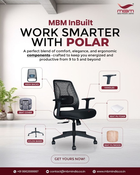
A clean, clinical presentation of an office chair showing its specific ergonomic components through a diagrammatic layout.
Free credits included. No card required
This office chair ad creative succeeds by using a minimalist, educational diagram to validate the product's quality. By isolating specific components like the mesh back, seat foam, and nylon base, the ad builds immediate credibility through visual proof of construction quality rather than abstract promises. The clean background prevents clutter, allowing the ergonomic features to stand out as the primary focus.
For most ecommerce brands selling high-consideration items, technical transparency often outperforms generic lifestyle shots. This pattern works well because it speaks directly to the analytical buyer who prioritizes durability and comfort. You can replicate this structural clarity by using Promer AI to organize your own product features into a similar high-conversion layout.
Great ads start from a logical presentation of utility and build trust through visible craftsmanship.
Pro tip
When using a diagram-style hook, don't label every single part; only highlight components that directly solve a specific customer pain point. In this case, focusing on the seat foam and back mesh speaks to the '9 to 5' comfort goal defined in the headline.




















Promer helps you find the pattern, adapt it to your product, and create your own version in minutes.






