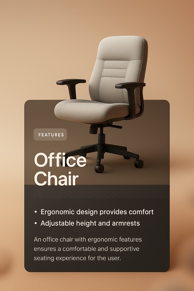
A clean, studio-lit ad creative highlighting key ergonomic benefits of an office chair against a soft, neutral background.
Free credits included. No card required
This Office Chair ad creative utilizes a high-contrast, minimalist visual strategy to drive focus directly onto the product's primary selling points. By isolating the chair against a neutral, warm background and pairing it with succinct bulleted benefits, the design removes all visual friction to communicate value instantly. This approach centers the user experience by prioritizing readability and product clarity over complex graphic elements.
For performance-driven furniture brands, this structure excels because it mirrors the way customers evaluate office equipment: looking for specific ergonomic data within a professional context. Using Promer AI to mirror this level of product isolation can help advertisers reduce creative fatigue. In most cases, simple, benefit-led visuals allow the product's inherent quality to serve as the primary emotional hook for the potential buyer.
Great advertising structure translates complex ergonomic features into simple, digestible promises that the user can immediately verify through the product image.
Pro tip
To increase engagement with this style, experiment with adding a soft drop shadow beneath the product to ground it in the frame, making it look less 'floated'. Additionally, ensure your bullet points lead with the tangible benefit—such as 'Reduce back strain'—rather than just the raw technical feature.


















Promer helps you find the pattern, adapt it to your product, and create your own version in minutes.






