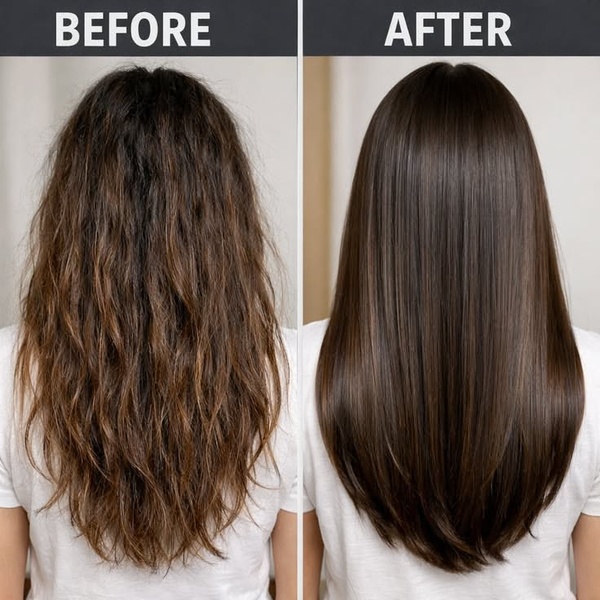
A split-screen comparison showing a dramatic improvement in hair texture and shine from a smoothing treatment.
Free credits included. No card required
This hair smoothing treatment ad creative leverages a classic split-screen layout to provide immediate visual proof of product efficacy. By positioning the 'Before' and 'After' states side-by-side, the ad eliminates the need for complex explanations and delivers an instant understanding of the primary value proposition to the viewer. Using a direct before-and-after visual hook is highly effective for beauty products because it provides tangible, unfiltered evidence of a desired result that triggers an immediate psychological shift in the prospect.
For most ecommerce teams, this structure works because it removes friction in the decision-making process by showing the end-state directly. You can recreate this high-converting layout using Promer AI to maintain this clean, comparative aesthetic for your own product range. Depending on your specific brand positioning, ensure the photography remains consistent across both states to avoid creating skepticism through lighting or quality discrepancies.
The most effective ads stop the scroll by proving value in a single glance rather than asking the user to read for it.
Pro tip
To increase the perceived authority of your before-and-after, ensure the lighting conditions are identical for both photos. Any variation in light quality can trigger skepticism in the viewer, making the results look manipulated rather than genuine.
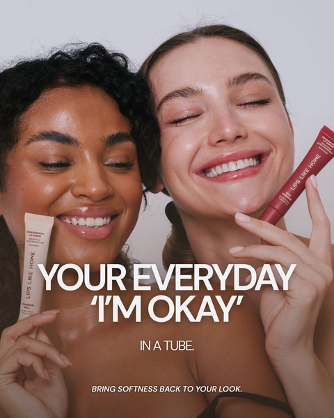
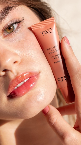
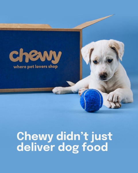








Promer helps you find the pattern, adapt it to your product, and create your own version in minutes.






