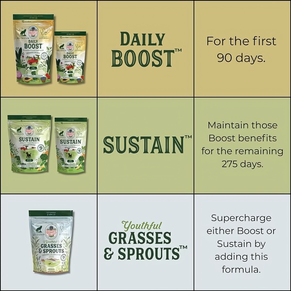
A clear, three-part grid layout showing specific dog supplements and their corresponding duration or usage purpose.
Free credits included. No card required
This dog supplement ad creative uses a clean, logical grid structure to simplify a complex multi-product daily routine for pet owners. By breaking down the usage into chronological steps, the brand removes the guesswork, which is the core strategy for high-converting educational content in the pet wellness space. This approach builds trust by clearly demonstrating how different supplements serve distinct, non-overlapping roles in a pet's life, rather than just showing a single product in isolation.
For most ecommerce teams, presenting a roadmap like this helps decrease friction in the decision-making process. You can easily replicate this structural clarity using Promer AI to maintain consistency across your own product line. This grid design typically performs well for products requiring habit formation or multi-product ecosystems, as it provides a digestible visual argument for the value of a complete bundle.
A clear, structured visual journey often outperforms a busy lifestyle image when the objective is to teach the customer how to use your products.
Pro tip
When creating multi-product grids, ensure your color palette follows the logic shown here by using subtle hue shifts to signify progression. This reinforces the 'before and after' or 'start and maintain' narrative without requiring the reader to process heavy amounts of text.




















Promer helps you find the pattern, adapt it to your product, and create your own version in minutes.






