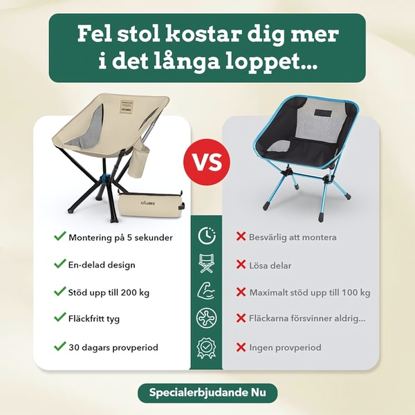
A square-format static comparison chart highlighting five key advantages of a premium camping chair versus a lower-quality alternative.

Us vs. Them Camping Chair Comparison

A square-format static comparison chart highlighting five key advantages of a premium camping chair versus a lower-quality alternative.

Ad Details
Style
Us and Them
Format
1:1
Industry
Hair Care
Platforms
Facebook · Instagram
Language
English
Clone this ad with AI

Free credits included. No card required

Why this ad works

This camping chair ad creative utilizes a classic comparison grid to strip away feature fluff and focus entirely on user pain points. By leveraging a clear visual contrast between the product's benefits and the common frustrations of competitors, the ad effectively forces the consumer to choose the path of least resistance.

For most ecommerce teams, this "Us vs. Them" structure provides a logical framework that justifies a price point or value proposition without needing aggressive sales language. You can replicate this strategic breakdown for your own inventory by using Promer AI to analyze the winning elements of your current product line and generate similar comparative assets.

The winning ingredients

  • Direct Comparison Grid The 1:1 square layout uses a clear 'VS' badge to divide the screen, allowing users to instantly compare product features at a glance.
  • Icon-Led Benefits Each benefit is paired with a recognizable icon, making the technical advantages like weight capacity and assembly time easy to scan on mobile.
  • High-Contrast Visuals The use of bold green checkmarks against subtle red crosses creates an immediate psychological distinction between the promoted chair and the inferior alternative.
A great comparison ad works because it does the mental heavy lifting for your customer by framing their purchase decision as a simple logical choice.

How to make it yours

  1. Start by identifying the main pain points your customers face with generic alternatives and use AI Ad Clone to import the layout of this comparison grid.
  2. Paste your product URL into the system to automatically swap in your specific product imagery, brand logo, and primary brand colors.
  3. Rewrite the comparative copy to highlight your specific unique selling points, select the 1:1 ratio, and generate several visual variations.

Pro tip

To increase the effectiveness of your comparison ad, ensure the 'losing' side reflects the most common frustrations your customer actually encounters in your specific category. Avoid making the competitor look unrealistic, as a credible 'Us vs. Them' comparison builds much higher trust with skeptical buyers.
Dog Joint Supplement Relief Sequence
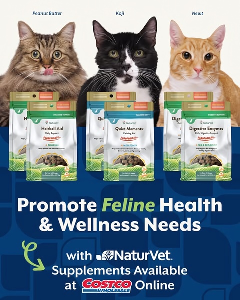
NaturVet Cat Supplement Retail Ad
NaturVet Calming Chews Ad
Problem-Solution Ingredient-Focused Ad
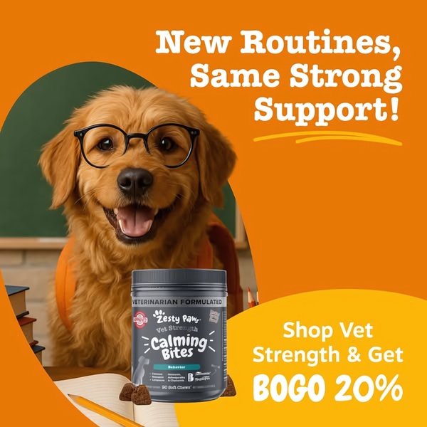
New Routines, Same Strong Support!
Dog Multivitamin Problem-Solution Ad
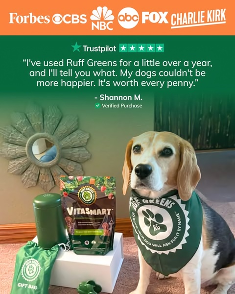
Social Proof Testimonial Ad for Dog Supplements
Dog Supplement Social Proof Ad
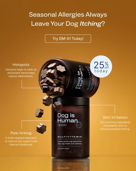
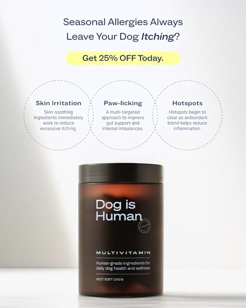
Dog Multivitamin Allergy Relief Creative
Dog Joint Supplement Pain-Relief Ad
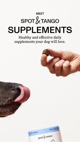
Spot & Tango Supplement Interaction
Spot & Tango Supplement Direct Interaction
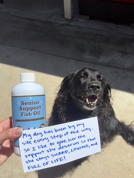
Handwritten Customer Testimonial
Dog Skin & Coat Supplement Ad
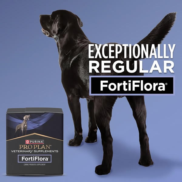
Exceptionally Regular Canine Probiotic
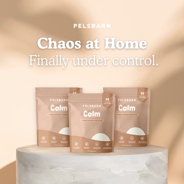
Chaos at Home Finally Under Control
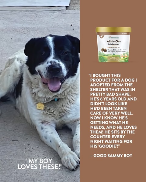
Dog Supplement Customer Testimonial
Dog Supplement Product Update
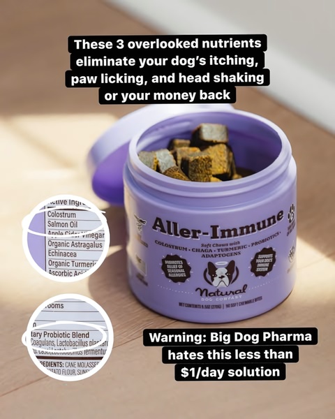
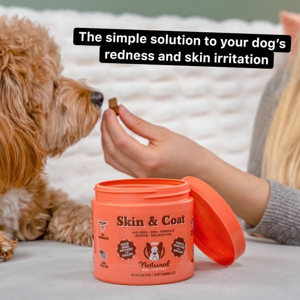
Natural Dog Company Skin & Coat Problem-Solution Creative
Pet Supplement BOGO Offer

Your next winning adis already out there.

Promer helps you find the pattern, adapt it to your product, and create your own version in minutes.


Free credits included
No credit card required
Ship in minutes.
Create your first ad free
Camping Chair Ad Creative: The Us vs. Them Comparison