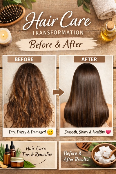
A clear, side-by-side comparison showcasing the visual improvement of hair from a damaged, frizzy state to a smooth, healthy appearance.
Free credits included. No card required
This hair care ad creative leverages a classic before & after split-screen layout to instantly communicate the product efficacy. By grounding the viewer in a relatable problem of damaged hair, the ad creates an immediate visual desire for the healthy, smooth end result shown on the right. Focusing on clear, high-contrast visual proof is a powerful way to reduce purchase hesitation.
For most ecommerce brands selling tangible outcomes, this side-by-side comparison remains a staple because it removes ambiguity about what the product does. Teams can use Promer AI to quickly map their own unique product images into this high-converting, trust-building structure, ensuring the aesthetic remains professional and consistent across all assets.
A winning creative should function as a visual shorthand that allows the customer to immediately understand the problem solved and the benefit gained.
Pro tip
When testing before and after ads, ensure your lighting conditions in both images are similar to prevent the viewer from feeling misled. A slight, authentic variance is better than a heavily filtered image that looks like a stock photo, as authenticity typically drives higher trust and engagement.
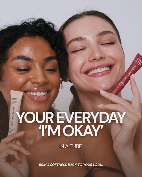
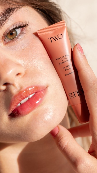
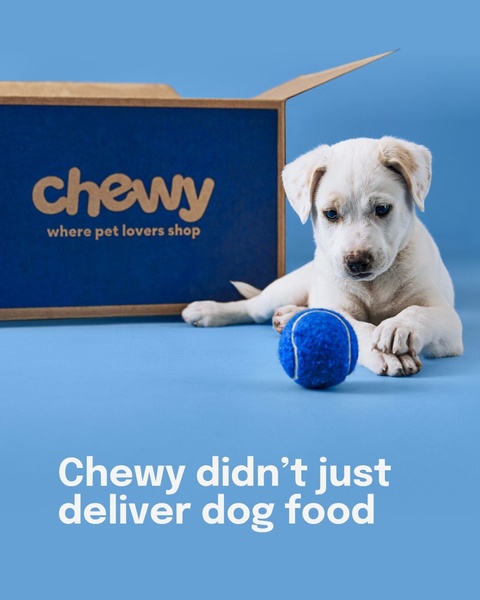






Promer helps you find the pattern, adapt it to your product, and create your own version in minutes.






