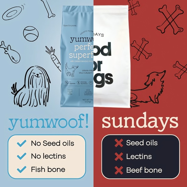
A side-by-side comparison creative using a split-screen layout to contrast ingredient quality between two pet food brands.
Free credits included. No card required
This dog food ad creative uses a high-contrast split-screen layout to establish immediate product authority. By visually anchoring the brand's 'yes' list against a competitor's 'no' list, the design creates a binary decision space where the viewer's choice is simplified through clear, itemized differentiation. This approach effectively weaponizes specific product attributes to frame the brand as the healthier, safer alternative in a crowded market.
Direct comparisons remove ambiguity for the consumer by presenting factual, scannable data points that justify a premium purchase. For most ecommerce teams, this structure works well because it taps into the 'us vs them' psychology that drives high-intent traffic to your store, a methodology you can easily replicate with Promer AI.
A powerful ad doesn't just show a product; it highlights the exact problem the customer wants to solve compared to what they are currently using.
Pro tip
When using a split-screen comparison, avoid listing more than three features per side. Keeping the copy sparse ensures the visual impact of the check marks stays strong on mobile screens where complex details often get lost.
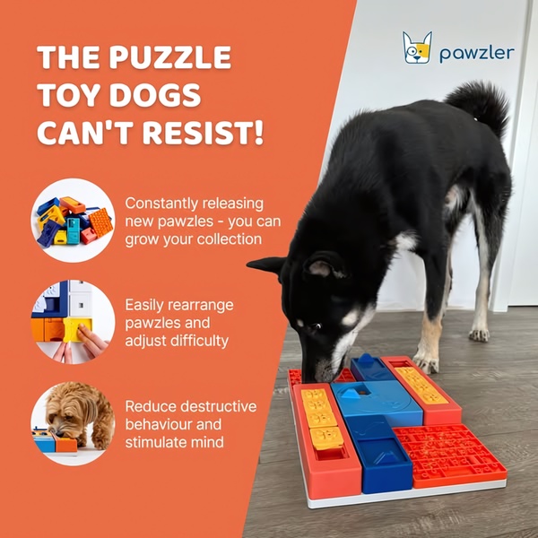
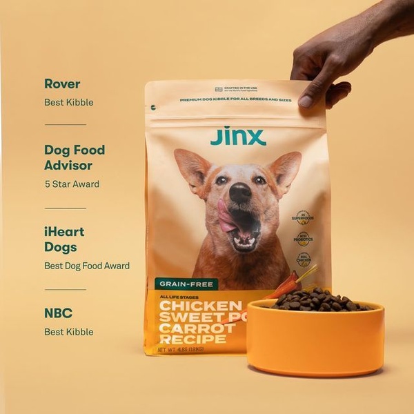
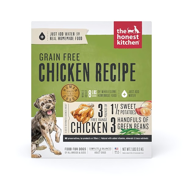






Promer helps you find the pattern, adapt it to your product, and create your own version in minutes.






