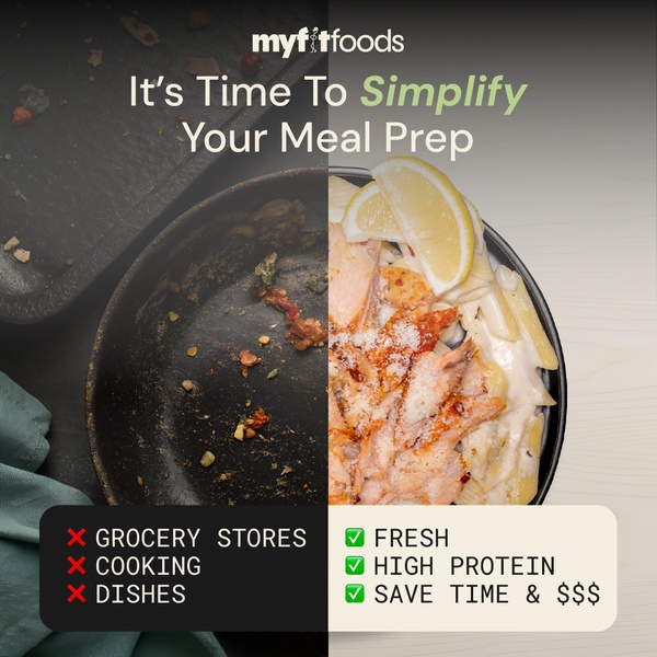
This static creative uses a split-screen comparison to show the pain of dirty pans against the ease and quality of a ready-to-eat meal.
Free credits included. No card required
This split-screen comparison leverages a high-contrast visual to anchor the value proposition of a meal prep kit by showing the immediate reduction in friction for the customer. By placing the chaotic, dirty reality of traditional cooking against the clean, fresh, and high-protein result of the service, the creative communicates utility without relying on complex storytelling.
For most ecommerce teams, this "us versus them" pattern effectively isolates the pain points—grocery stores, cooking, and dishes—to build immediate mental association with relief. Using Promer AI allows you to test these structural layouts to see which visual tension, whether dirty pans or empty grocery carts, better drives engagement for your specific niche.
Great performance ads start from a singular, tangible feeling of relief rather than an abstract product description.
Pro tip
When using this comparison format, ensure your "before" visual is authentic and visually chaotic to create enough contrast. You want the user to feel the relief in the "after" image, so choose product shots that look exceptionally appetizing and polished.




















Promer helps you find the pattern, adapt it to your product, and create your own version in minutes.






