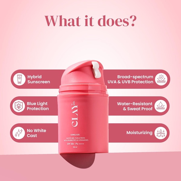
This ad highlights essential sunscreen features in a clear, organized layout. It uses a clean visual approach to communicate product benefits directly.
Free credits included. No card required
This creative focuses on a direct feature breakdown to communicate the unique selling points of the sunscreen instantly. By pairing clear, recognizable icons with concise labels, the ad removes cognitive friction and allows the consumer to digest the product benefits in seconds without needing to watch a long-form video. The monochromatic color palette ensures the focus remains entirely on the product bottle, establishing a brand-first professional identity. Performance marketers at Promer AI often see high engagement with this layout because it anticipates the user's top questions before they even scroll past. Using a clear visual hierarchy of benefits provides immediate clarity that builds trust, which is essential for skincare products where consumers have specific concerns like white cast or water resistance.
Great ads start from an idea, a feeling, or a structure, not a blank design.
Pro tip
Keep your feature labels under five words to maintain the clean, minimalist look. If your product is for a specific skin type, add a small, clear text badge near the main image to further boost relevance.




















Promer helps you find the pattern, adapt it to your product, and create your own version in minutes.






