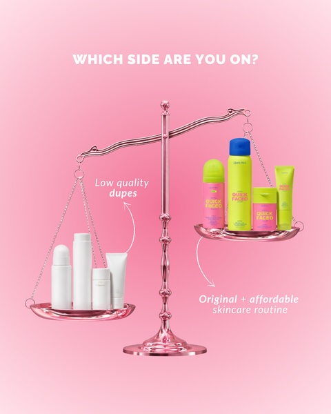
A high-contrast visual ad using a physical scale to illustrate the difference between low-quality dupes and an original, affordable skincare routine.
Free credits included. No card required
This creative leverages a visual scale to physically demonstrate the superiority of your skincare routine against generic market alternatives. By isolating the product on one side of a balanced scale, the brand creates an instant mental shortcut for quality, making the viewer's choice feel obvious and logical before they even read a line of text. This contrast-based approach relies on a minimalist aesthetic to remove cognitive load, allowing the viewer to instantly grasp the 'Us vs Them' value proposition.
For most ecommerce teams, this pattern works because it pivots away from feature-dumping and toward an emotional, aesthetic decision. Utilizing Promer AI allows you to recreate this exact balanced composition with your own assets, ensuring your visual hierarchy remains clean and focused. In most cases, simple, high-contrast images like this stop the scroll by breaking the visual monotony of busy, text-heavy feeds.
Great ads are built on a clear, visual thesis that communicates value in a single, balanced glance.
Pro tip
When using a 'Us vs Them' comparison, ensure the visual weight of your product side is intentionally larger or more vibrant than the competitor side. This subliminal choice reinforces the feeling that your brand is the more significant and valuable option in the category.




















Promer helps you find the pattern, adapt it to your product, and create your own version in minutes.






