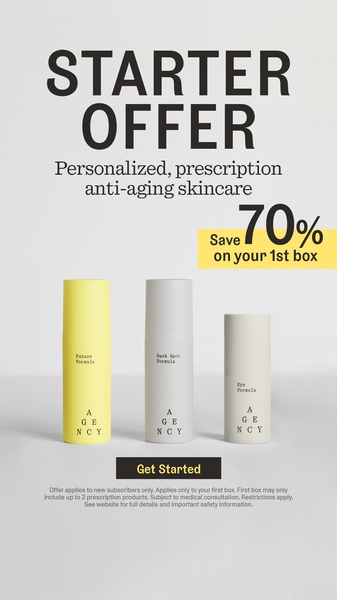
A high-contrast, minimalist promotional graphic for prescription skincare featuring a bold 70% off incentive.
Free credits included. No card required
This skincare ad utilizes a high-contrast minimalist aesthetic to ensure the primary offer is immediately legible on mobile feeds. By isolating the product against a neutral background and anchoring the discount in a standout yellow block, the brand removes all visual friction to focus the viewer entirely on the conversion incentive.
For most ecommerce teams, this structure works because it avoids the fatigue of complex collages, opting instead for a clear value-exchange path. With Promer AI, you can replicate this clean, direct messaging hierarchy to test your own promotional offers without needing extensive design resources.
Great ads start from an idea, a feeling, or a structure, not a blank design.
Pro tip
When running discount-focused ads like this one, ensure your offer is the most prominent element in the hierarchy. Use your brand's secondary color to highlight the percentage off, just as this creative uses yellow, to create a visual anchor that guides the user's eye directly to the 'Get Started' button.




















Promer helps you find the pattern, adapt it to your product, and create your own version in minutes.






