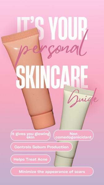
A vertical graphic ad featuring two skincare tubes with clean, benefits-driven text overlays against a soft pink gradient background.
Free credits included. No card required
This skincare cream creative succeeds by positioning the product as an essential component of a personal routine through a clean, educational structure. By using a soft gradient background paired with clear, benefit-focused bullet points, the ad avoids visual clutter and keeps the viewer focused on the value proposition rather than just the packaging design. The primary reason this approach works is that it translates complex product benefits into an easily digestible guide, turning the ad into a helpful tool rather than a standard sales pitch.
For teams using Promer AI to refine their creative strategy, this pattern demonstrates the power of prioritizing readability in mobile-first environments. By framing the product as an authority on skin health, the ad lowers friction for users who are already actively searching for solutions to specific concerns like acne and sebum control. In most cases, distilling your product's core utility into 4-5 clear claims is more effective for conversion than broad, unverified promises.
Great ads are built on a structure that respects the user's time by clearly presenting the value of the product within the first two seconds.
Pro tip
When creating benefit-focused graphics, ensure your text contrast ratio is high enough to be readable against your chosen background. Test multiple benefit permutations to see which specific skincare claim resonates most with your target audience before scaling.




















Promer helps you find the pattern, adapt it to your product, and create your own version in minutes.






