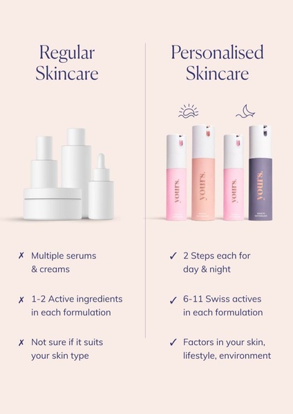
A clear, side-by-side comparison chart illustrating the specific advantages of a personalized skincare routine compared to generic products.
Free credits included. No card required
This ad uses a side-by-side comparison chart to simplify the complex decision-making process for potential skincare customers. By anchoring the 'regular' category against a 'personalized' solution, the brand clearly defines its value proposition without needing aggressive sales copy or complex video animation.
Great ads start from a logical structure that makes the customer feel smarter for choosing your solution.
Pro tip
When using comparison charts, always ensure the 'us' column clearly addresses the specific pain points mentioned in your competitor's low-performing reviews. Keep your labels punchy and focus on the scientific or lifestyle benefit rather than just generic features.




















Promer helps you find the pattern, adapt it to your product, and create your own version in minutes.






