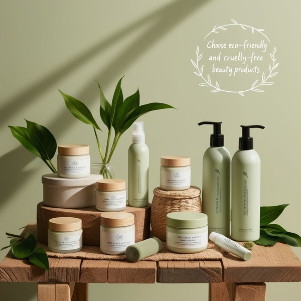
A clean, studio-lit display of various skincare jars and bottles arranged on a wooden table, emphasizing a natural and eco-conscious product line.
Free credits included. No card required
This skincare ad strategy relies on a clean, intentional visual hierarchy that builds immediate consumer trust. By utilizing a soft, monochromatic sage green palette and natural wood accents, the image communicates organic quality before the viewer even reads the text, making it a perfect example of a visual authority hook.
A truly effective ad creative communicates the essence of the product through color, composition, and texture rather than relying on heavy sales copy alone.
Pro tip
If you are selling a collection, ensure your packaging designs have consistent branding that complements your background color choice. In most cases, a 1:1 ratio is ideal for high-impact social commerce, but consider using a neutral tone like sage or warm beige to lower the barrier to engagement.




















Promer helps you find the pattern, adapt it to your product, and create your own version in minutes.






