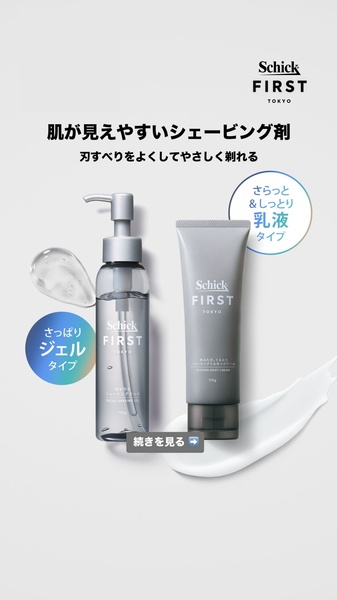
A high-contrast, clean 9:16 vertical layout comparing a shaving gel and a shaving cream with clear benefit callouts.
Free credits included. No card required
This creative focuses on the core functional benefits of a shaving gel by using a clean, uncluttered layout that highlights the two distinct product textures. The direct visual comparison leverages the clean studio aesthetic to quickly communicate product choice to the user without overwhelming them with text. By presenting the two product types side-by-side with clear descriptors, the ad immediately lowers cognitive load for the viewer.
Such high-contrast, informative layouts are highly effective for consumer goods when you need to educate a customer on product variations. Teams using Promer AI can easily replicate this comparative structure to test which product features resonate most with their specific target audience, typically seeing improved clarity in conversion-focused campaigns.
A winning comparison ad relies on the power of simplicity to make the value proposition instantly readable.
Pro tip
When creating comparison ads, ensure your product imagery shows the texture or application consistency. This tangible visual clue reinforces the written benefits and helps the customer choose the version best suited to their needs.




















Promer helps you find the pattern, adapt it to your product, and create your own version in minutes.






