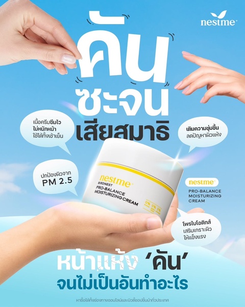
This creative highlights the benefits of a moisturizing cream by directly addressing skin discomfort and environmental stressors in a clean, professional layout.
Free credits included. No card required
This moisturizing cream creative uses a high-contrast, pain-point driven strategy that immediately establishes relevance for users suffering from skin discomfort. By leading with a direct question that mirrors the consumer's emotional frustration, the ad effectively halts the scroll and positions the product as the essential solution. The clean, light-blue color palette reinforces a sense of freshness and clinical relief that matches the brand's promise of balance and protection.
Following this pattern allows Promer AI users to replicate a high-converting layout that balances information with clarity. For most beauty teams, this visual structure succeeds because it avoids clutter and forces the viewer to process a logical progression from the emotional problem to the functional solution. Testing such clear, benefit-driven frames is a standard, repeatable approach for products that solve specific, immediate physical needs.
Great ads start from an idea, a feeling, or a structure, not a blank design.
Pro tip
When focusing on a specific pain point like skin dryness, ensure your visual callouts match the severity of the problem mentioned in your headline. Use clear icons or short, punchy phrases to keep the layout breathable rather than overwhelming the reader with too much text.




















Promer helps you find the pattern, adapt it to your product, and create your own version in minutes.






