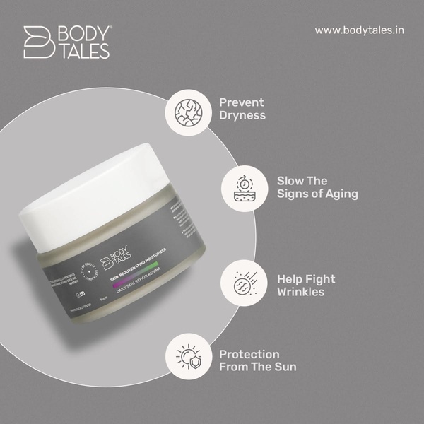
A clean, minimalist 1:1 product display featuring a clear list of four key skin health benefits arranged in a balanced grid.
Free credits included. No card required
This moisturizer ad uses a clean grid layout to prioritize key benefits over complex lifestyle imagery. Structuring information as a clear, scannable feature list is a powerful way to reduce cognitive load for consumers evaluating skincare solutions. By placing the product in the center and radiating the benefits outward, the visual hierarchy immediately guides the eye from the product to its specific promises.
For most ecommerce teams, this approach works because it mimics clinical presentation styles often associated with dermatology and trust. Using Promer AI allows you to test this layout style against more lifestyle-heavy variations to determine which visual hierarchy performs better for your specific audience segments.
Great ads start from an idea, a feeling, or a structure, not a blank design.
Pro tip
Keep your benefit copy concise to ensure it matches the simple, elegant line-art icons. If your moisturizer has more complex scientific benefits, swap the icons for small, high-quality ingredient images to maintain the grid's visual cleanliness.




















Promer helps you find the pattern, adapt it to your product, and create your own version in minutes.






