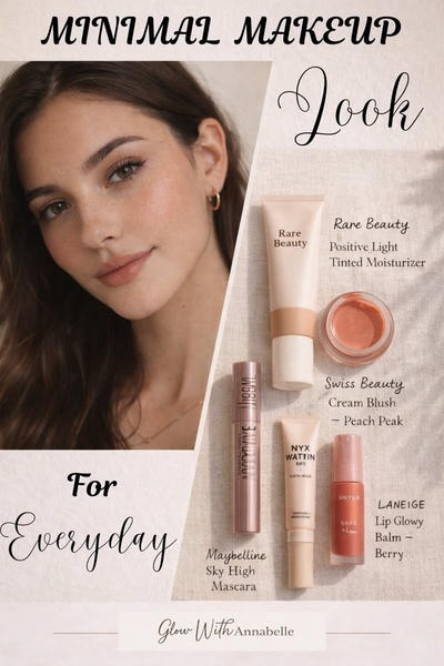
A split-screen composition featuring a high-quality model portrait on the left and a flat-lay product lineup on the right to present an effortless beauty routine.
Free credits included. No card required
This makeup ad works because it pairs an aspirational human element with a clear, functional list of products, making the routine feel both attainable and desirable. By using a split-screen design, the brand immediately validates the result of using the products before the user even reads the product list.
For most ecommerce brands in the beauty space, this pattern effectively reduces the cognitive load of discovery by showing exactly what to buy to achieve a specific look. You can apply this organized structural logic to your own catalog using Promer AI, ensuring that your product features are always presented with context and clarity.
Great ads start from an idea, a feeling, or a structure, not a blank design.
Pro tip
When using a split-screen layout, ensure the model portrait aligns with the color temperature of your product photography. This continuity prevents the ad from feeling disjointed and reinforces a professional, brand-aligned visual identity.




















Promer helps you find the pattern, adapt it to your product, and create your own version in minutes.






