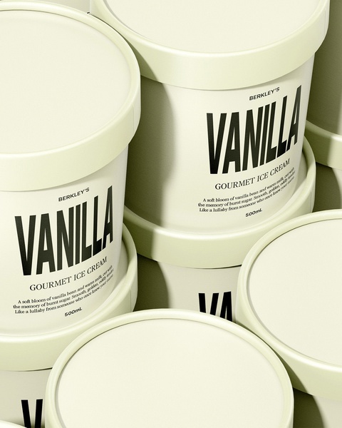
A top-down view of multiple tubs of vanilla ice cream arranged in a symmetrical, high-key grid to emphasize packaging and brand identity.
Free credits included. No card required
The effectiveness of this ice cream creative hinges on the use of deliberate, high-key minimalism and repetitive symmetry to command attention in a crowded feed. By focusing entirely on the typography and the clean, consistent packaging, the visual design removes all distractions to position the product as a premium, artisan choice. This approach forces the viewer to process the brand name and identity immediately, creating a lasting mental anchor for the product. Promer AI enables teams to replicate these high-end compositions without the need for expensive, recurring professional studio sessions.
Great ads start from a singular, clean design structure that highlights the product's identity rather than competing with it.
Pro tip
For products with distinct typography, lean into high-contrast black and white color schemes to make the logo pop. Use this minimalist approach to reduce cognitive load and emphasize the perceived value of the product.




















Promer helps you find the pattern, adapt it to your product, and create your own version in minutes.






