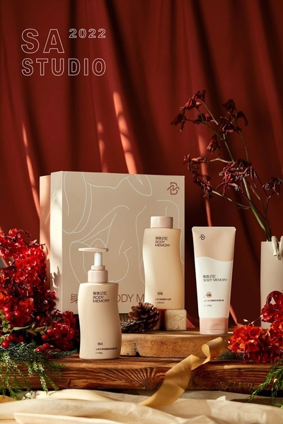
A high-end, seasonal display of three body care products arranged on a wooden surface with red curtains and dried foliage.
Free credits included. No card required
This seasonal composition utilizes a warm color palette to position the body lotion as a luxury experience. By framing the product with autumnal colors and rich textures, the brand creates a sensory-first connection that elevates the perceived value of the items. The strategic use of negative space allows the product labels to remain the focal point while the background details provide context. This approach works for Promer AI users because it shifts the focus from simple feature listing to lifestyle aspiration, which is critical for beauty and personal care audiences.
A winning product hero is less about the item itself and more about the atmosphere of comfort and luxury it promises to the customer.
Pro tip
When recreating this look, ensure your product labels provide a high-contrast accent to the background. If your packaging is dark, use lighter lighting or a cream-toned background to maintain the same visual hierarchy seen here.




















Promer helps you find the pattern, adapt it to your product, and create your own version in minutes.






