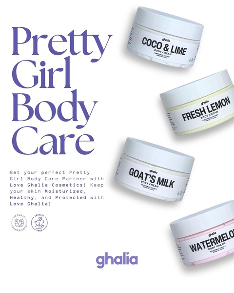
A clean, minimalist 4:5 ratio ad showcasing four different body cream variants with clear product labeling and brand messaging.
Free credits included. No card required
This aesthetic body cream grid uses a clean, airy layout to emphasize product variety and brand accessibility. By grouping multiple scents and formulas, the visual style creates a high-perceived value that suggests a complete self-care range rather than a single commodity.
For most ecommerce teams, this structure works because it removes the cognitive load of choosing a product by showcasing options clearly against a white, non-distracting background. This Promer AI approach focuses on visual clarity, which typically boosts engagement for beauty products by allowing the consumer to see all options at a glance.
A well-structured product grid does more than show items; it tells a story of choice and quality through visual organization.
Pro tip
When using a grid layout, ensure your product labels are sharp and legible on mobile screens. If your packaging is subtle, consider adding a slightly larger or centered 'hero' product to draw the eye first.




















Promer helps you find the pattern, adapt it to your product, and create your own version in minutes.






