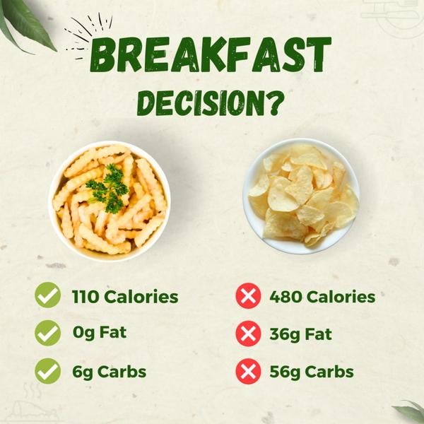
A square ad creative comparing the nutritional value of two different snack items using a split-screen design to highlight health benefits.
Free credits included. No card required
This healthy fries ad creative leverages a classic 'Us vs. Them' framework to make the viewer's purchasing decision feel logical and immediate. By placing a healthier alternative side-by-side with a traditional, high-calorie snack, the creative removes ambiguity and presents an objective argument for the product. This binary comparison strategy creates a visual 'aha' moment that cuts through the noise of cluttered social feeds.
For ecommerce teams looking to highlight specific value propositions like health benefits or efficiency, this structure is highly effective because it simplifies complex information into digestible, actionable data. You can quickly adapt this format by using Promer AI to swap in your product assets while maintaining the logical structure that drives consumer conviction. In most cases, these simple comparison templates perform well by targeting the customer's desire for an easy, 'no-guilt' choice.
A winning ad works by translating your product's core benefit into a visual truth that the customer can grasp in less than a second.
Pro tip
When using a comparison hook for healthy food, ensure your 'winning' side is visually appealing enough to compete with the indulgent alternative. Even if the numbers favor your product, the actual visual representation of the food must look delicious to win the customer's appetite as well as their logic.







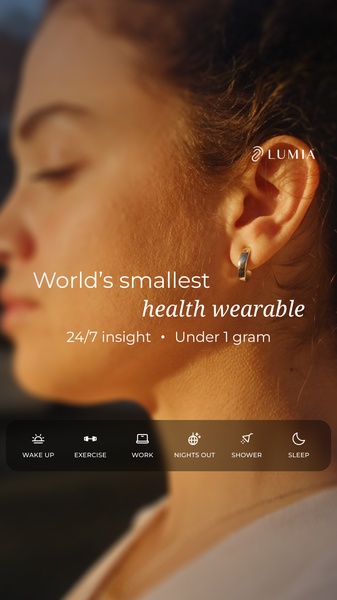
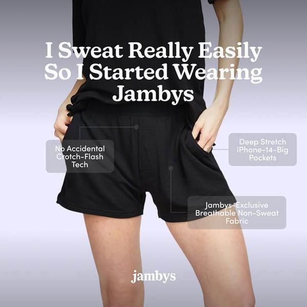
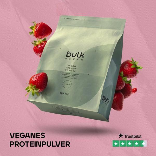

.png)
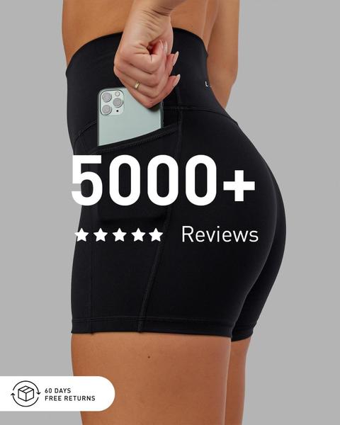
Promer helps you find the pattern, adapt it to your product, and create your own version in minutes.






