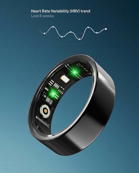
A high-contrast studio shot of a smart ring displaying internal sensors alongside an 8-week Heart Rate Variability trend line.
Free credits included. No card required
This Smart Health Ring ad creative leverages a technical data visualization strategy to establish instant credibility. By highlighting the internal sensor array alongside a clear Heart Rate Variability trend line, the brand creates a compelling bridge between physical hardware and actionable health metrics that appeals to data-conscious users.
This approach works because it replaces abstract marketing claims with tangible, observable features. When you use Promer AI to mirror this structure, you focus the viewer on the sophisticated engineering behind the product. For most ecommerce teams, visualizing data trends typically performs better than lifestyle shots alone, depending on how closely the data aligns with the specific pain points your customers want to solve.
Great ads start from an idea, a feeling, or a structure, not a blank design.
Pro tip
To make this style work for your category, pair your hardware shots with a real, simplified data chart that reflects the primary user benefit. Avoid over-complicating the graph; the goal is to make the trend instantly readable in under two seconds.
.png)

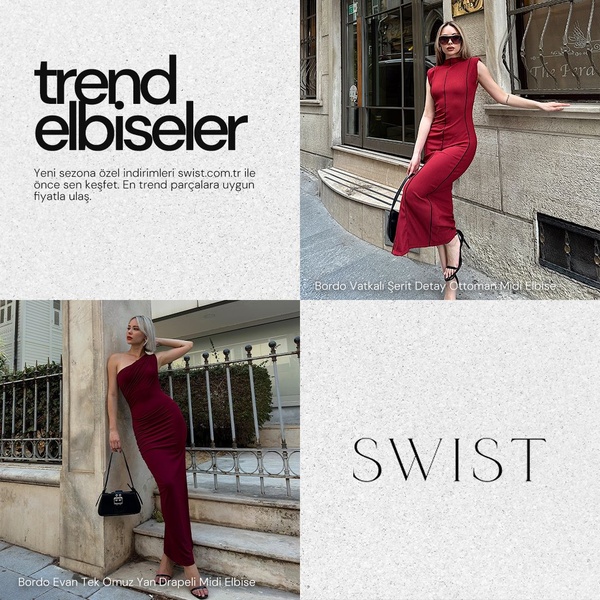












Promer helps you find the pattern, adapt it to your product, and create your own version in minutes.






