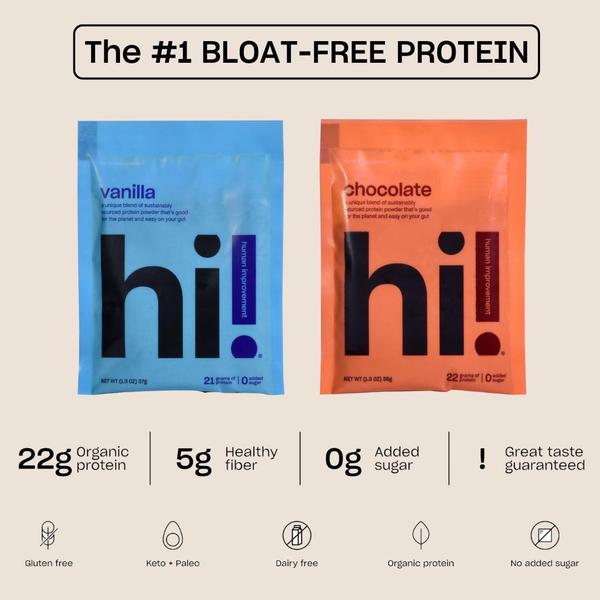
A clean, dual-product display highlighting product benefits and certifications through a minimalist, text-focused grid layout.
Free credits included. No card required
This protein powder ad creative wins by leveraging a minimalist, problem-solving hook that immediately addresses the audience's primary pain point: digestive discomfort. By placing the bold claim 'The #1 BLOAT-FREE PROTEIN' at the top, the creative immediately establishes authority and relevance for the viewer.
The structure uses a high-contrast color split to showcase variety while keeping the informational hierarchy clean and readable. This approach is highly effective in most cases for health products because it avoids visual clutter, allowing the Promer AI user to focus the viewer's attention on the specific functional benefits like fiber content and sugar-free certification.
Great ads start from an idea, a feeling, or a structure, not a blank design.
Pro tip
When using a split-product layout, ensure your background color remains neutral to keep the text legible. This allows you to highlight two different products without losing the core conversion message.









.png)
Promer helps you find the pattern, adapt it to your product, and create your own version in minutes.






